Master Your Design Palette: The Ultimate Guide to Using Coolors for Stunning Visuals
In the world of design, whether you are building a high-conversion Shopify store, designing a mobile app, or simply branding your social media, color is your most powerful silent communicator. It evokes emotion, establishes trust, and guides the user’s eye. Yet, finding that “perfect” combination of hues can often feel like a daunting task of trial and error.
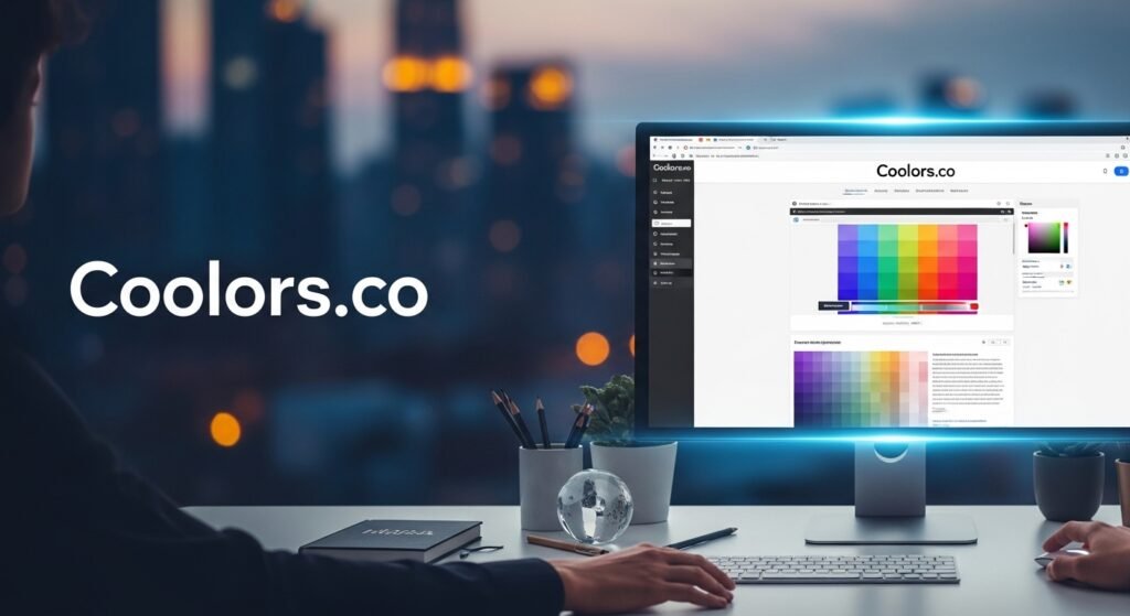
Enter Coolors, the “lightning-fast” color palette generator that has become a staple in the toolkit of over 8 million creatives. In this guide, we will dive deep into how you can leverage this tool to transform your creative workflow and create professional-grade designs effortlessly.
1. The Power of Instant Inspiration: The Spacebar Magic
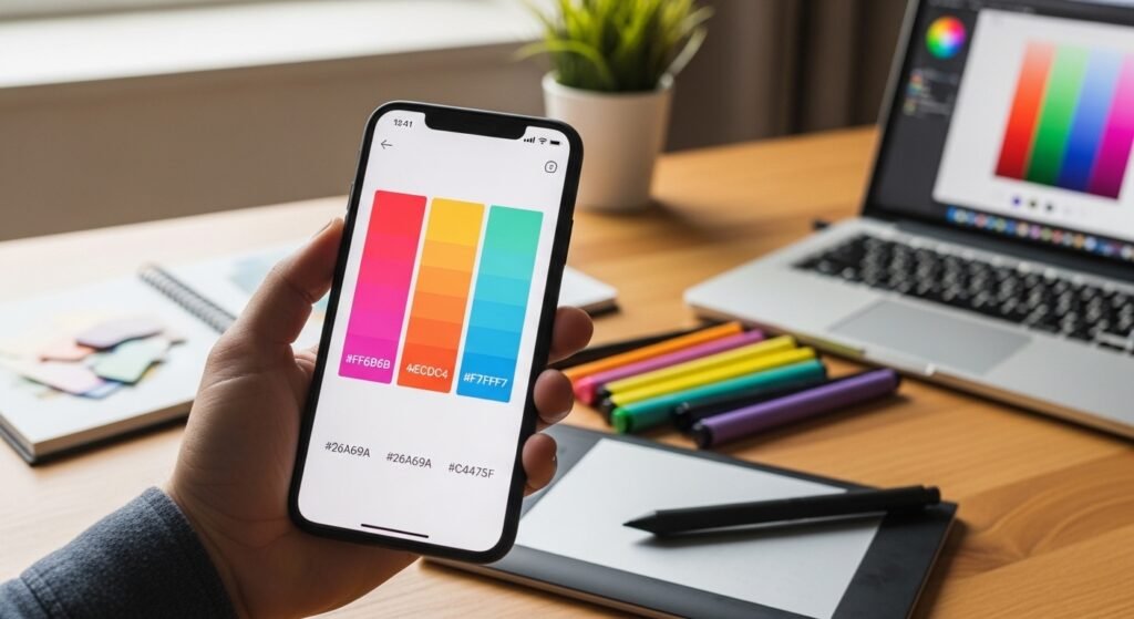
The flagship feature of Coolors is its sheer speed. For many designers, the “blank canvas” syndrome is the biggest hurdle. Coolors solves this with its Palette Generator.
By simply hitting the spacebar, the algorithm generates a harmonious five-color palette.
- Pro Tip: If you find one or two colors you love, you can “lock” them and hit the spacebar again. The tool will then intelligently find new colors that perfectly complement your locked choices. This balance of automation and human intuition is what makes it a favorite among top-tier design companies.
2. More Than Just a Generator: A Full Suite of Tools
Coolors is no longer just a “click and generate” site. It’s an entire ecosystem of design resources. Let’s break down the standout features:
A. The Image Picker: From Photography to Palette
Have you ever seen a photograph and thought, “I want my website to feel like that sunset”? The Image Picker allows you to upload any photo and extract its dominant and accent colors. This is a game-changer for branding, as it ensures your color palette matches the mood of your professional photography.
B. Contrast Checker: The Key to Accessibility
In 2024 and beyond, accessibility is not optional. The Contrast Checker tool on Coolors allows you to calculate the contrast ratio between your text and background.
- Why it matters: Ensuring your colors meet WCAG (Web Content Accessibility Guidelines) means your content is readable for everyone, including those with visual impairments. This isn’t just ethical; it’s a critical component of professional UX/UI design.
C. Palette Visualizer: See it in Action
One of the hardest parts of picking colors is imagining them on a real product. The Palette Visualizer allows you to preview your selected colors on actual designs—be it a website layout, a mobile app interface, or a dashboard—before you commit a single line of code.
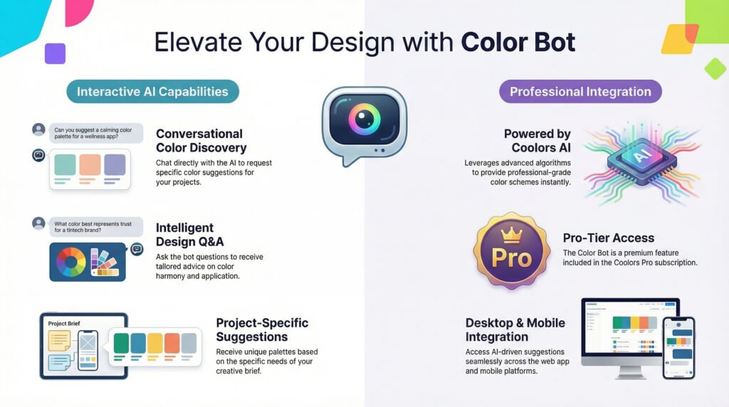
3. Designing with the Future: AI and Integration
Coolors is moving with the times by incorporating AI-driven features. With their new Color Bot, you can actually chat with an AI assistant to get suggestions.
“I’m building a luxury skincare brand for Gen Z. What colors suggest both premium quality and eco-friendliness?”
The AI can suggest palettes based on your specific marketing goals, saving hours of mood-boarding.
Workflow Integration: Where You Work
The real value of a tool is how well it fits into your existing workflow. Coolors offers:
- Figma Plugin: Export your palettes directly into your Figma workspace.
- iOS App: Carry your inspiration in your pocket.
- Chrome Extension: Grab colors from any website you browse.
4. Expanding Your Creative Horizons: Gradients and Fonts
Beyond individual hex codes, Coolors has branched out into:
- Gradients: Explore thousands of smooth transitions or create your own custom gradient palettes.
- Free Fonts: Typography and color go hand-in-hand. Coolors now curates a list of free fonts to help you pair your new palette with the right typeface.
- Collage Maker: Perfect for social media managers and mood-boarders looking to combine imagery and color schemes into one cohesive graphic.
Final Thoughts: The Goal is Visual Harmony
Whether you are using the Color of the Day (like the relaxing Maya Blue #73C2FB) as a starting point or exploring the 10 million+ community-created palettes, the goal is always the same: visual harmony.
A great color palette doesn’t just look “cool”—it tells a story. It can turn a simple Shopify store into a professional brand or a basic presentation into a memorable experience. With tools like Coolors, professional-level design is no longer locked behind years of color theory study; it’s literally just a spacebar click away.
Ready to make something coolorful? Start with the generator and let your creativity take the lead.