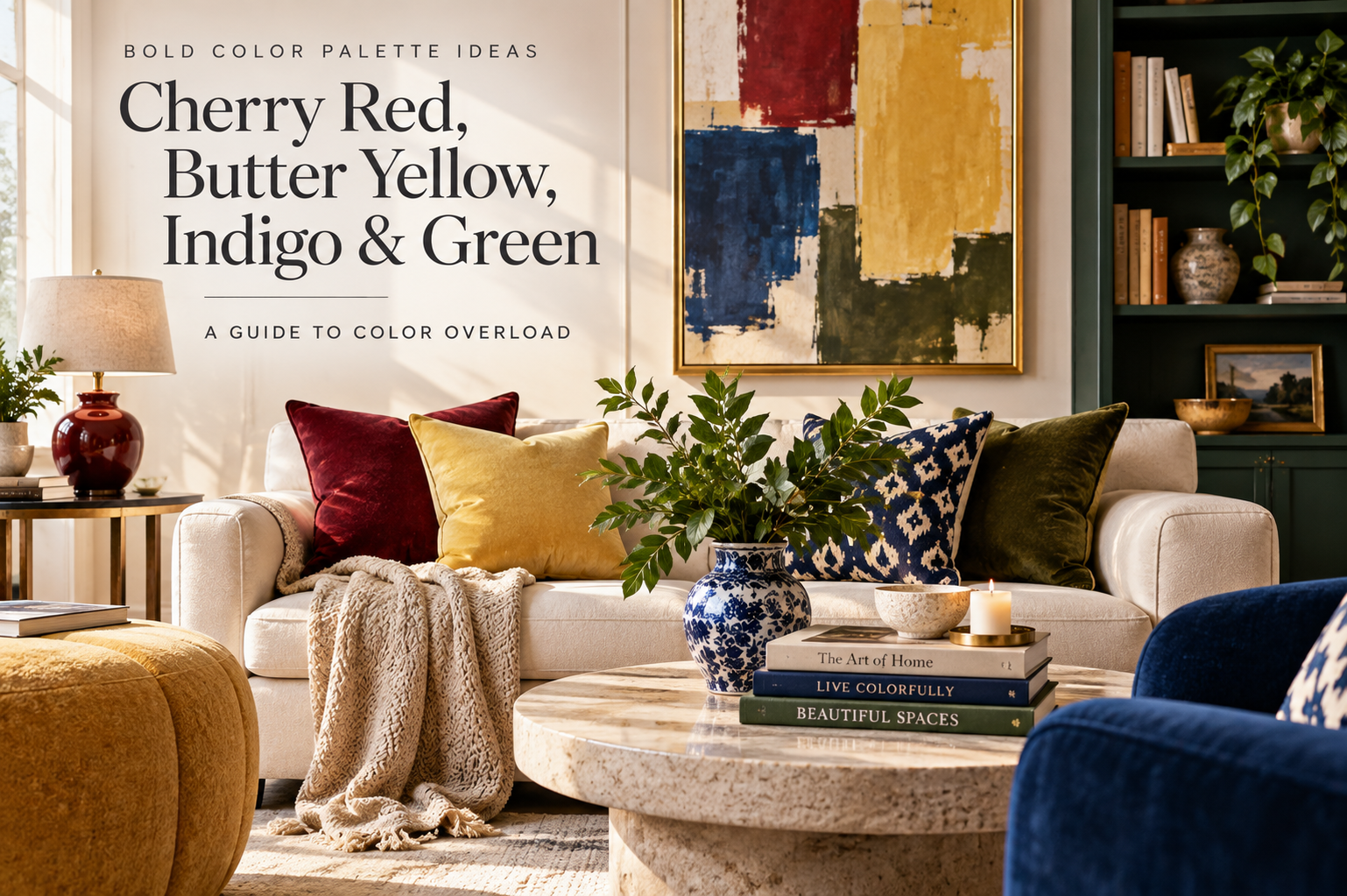
Bold Color Palette Ideas: Cherry Red, Butter Yellow, Indigo & Green
Bold color did not disappear with the 2025 trend cycle. In 2026, interiors are moving even further away from flat, cool-gray rooms and toward warmer neutrals, saturated accents, jewel tones, and expressive layers.
That makes Cherry Red, Butter Yellow, Indigo, Dill Green, and warm oat neutrals useful far beyond a single forecast. The trick is not using every strong shade at once, but choosing one dominant color, one supporting hue, and a quieter base.
These bold color palette ideas show how to use saturated shades room by room, balance them without visual clutter, and bring them in through furniture, textiles, rugs, lighting, and smaller statement pieces.
Key Takeaways
- Discover bold color combinations that still feel current in 2026
- Learn how to incorporate Cherry Red, Butter Yellow, and other must-have colors into your home decor
- Understand the importance of balancing bold colors to avoid color overload
- Learn how to style saturated colors without overwhelming the room
- Create a harmonious and visually stunning home decor
The Evolution of Color Trends in Interior Design
Interior color trends evolve quickly, but the strongest ideas often last beyond a single season. The shift toward warmer neutrals, richer reds, confident blues, and nature-led greens has continued because these shades add depth and personality without requiring a complete redesign.
How Color Trends Emerge and Evolve
Color trends come from many places. Things like culture, society, and money play big roles. Designers look at these to guess what colors will be popular next.
For example, people wanting to save the planet have made earthy colors popular. And new tech lets us use bright colors easily.
How Bold Color Trends Have Evolved
Recent palettes have moved toward stronger contrast: deep jewel tones, warm earthy shades, softened pastels, and creamy neutrals. That mix gives you room to create either a dramatic maximalist interior or a quieter space with one concentrated color moment.
Why Color Forecasting Matters for Home Design
Knowing about color trends is key for home design. It helps people and designers keep up with the latest. By knowing what’s coming, they can pick colors that make their homes look good and stay current.
| Trend | Description | Impact on Design |
|---|---|---|
| Bold Colors | Vibrant hues making a statement | Creates focal points in rooms |
| Earth Tones | Natural colors inspired by nature | Bring warmth and coziness to spaces |
| Pastel Shades | Soft, calming colors | Adds a touch of elegance and sophistication |
By getting the color trend changes, homeowners can make spaces that are beautiful. And show off their own style.
How to Use a Bold Color Palette Without Color Overload
The 2025 color palette is full of hues. It’s both exciting and overwhelming. Choosing the right colors for your home can be hard.
Understanding the Concept of Color Overload
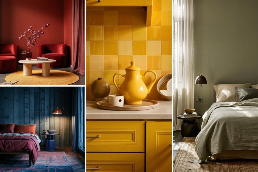
Color overload happens when there are too many colors to pick from. This is big in interior design. The right colors can change how a room feels and looks.
The 2025 palette has many colors. You can find bold colors like Cherry Red and calm neutrals like Alpine Oat.
Why This Bold Palette Still Works
The 2025 palette is special because it mixes bright and soft colors. It’s not just about bold colors. It’s also about finding balance in your home.
This palette focuses on color scheme ideas that make you feel good. Colors like Butter Yellow and Dill Green are not only pretty. They also make you feel warm and hopeful.
The Psychology Behind This Year’s Color Selections
Knowing why certain colors were chosen for 2025 helps you pick better. Aura Indigo is for spiritual depth. Alpine Oat is calming and neutral.
Thinking about how colors affect us helps create a beautiful and supportive space. It’s not just about looks. It’s about feeling good too.
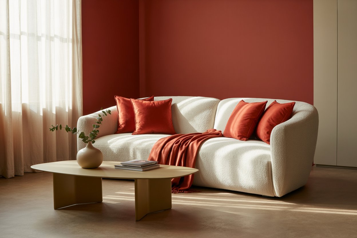
Cherry Red: A Bold Statement Color
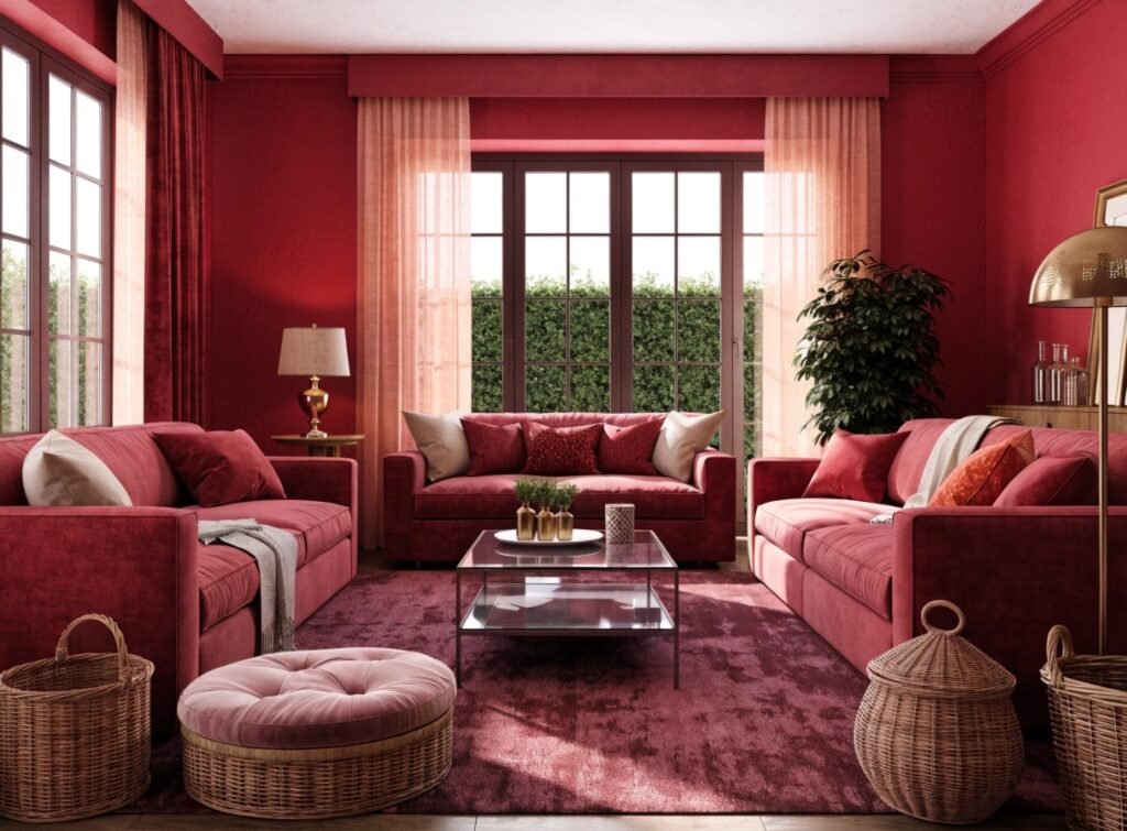
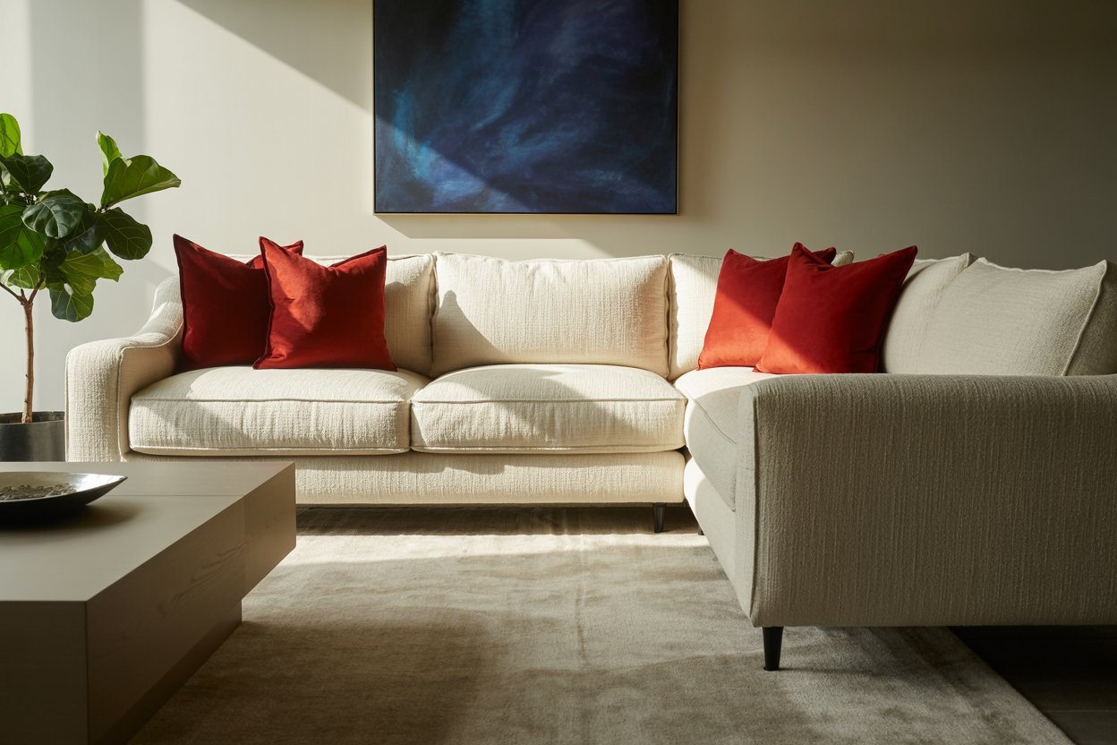
The 2025 color palette is all about making a statement. Cherry Red leads the charge with its bold, energetic vibe. It’s a standout choice for adding a pop of color to your space.
Psychological Impact of Cherry Red
Cherry Red is more than a striking color. It has a big impact on our feelings. This vibrant hue boosts energy and passion.
Energizing Effects: Cherry Red makes our heart rate go up. It’s great for rooms that need energy and creativity.
Emotional Connection: The color red is linked to love and passion. It adds an emotional layer to the spaces where it’s used.
Best Rooms for Cherry Red Integration
Cherry Red is bold in any room. But some spaces get more from its energy. Here are a few ideas:
- Living rooms where families gather and entertain
- Home gyms or workout areas to boost energy
- Kitchens, where it can stimulate appetite and conversation
Cherry Red in Different Design Styles
Cherry Red fits many design styles, from modern to traditional. In modern designs, it works as an accent wall or in bold furniture. In traditional settings, it adds classic elegance to decor or accessories.
For a color overload guide with Cherry Red, balance it with neutral tones. This balance creates a harmonious and inspiring space.
Understanding Cherry Red’s impact and versatility helps you create a palette inspiration that shows your personality. Whether you want to make a bold statement or just add color, Cherry Red is a great choice for 2025.
Butter Yellow: Bringing Warmth and Optimism
Butter Yellow is a key color for 2025. It’s warm and optimistic. This color makes any space feel welcoming.
The Psychological Effects
Butter Yellow lifts our mood and calms us. It makes us feel happy and relaxed. This color is great for places where you want to chill or hang out.
It can make us feel energized or calm, depending on how it’s used. This makes it very versatile.
Incorporating Butter Yellow in Different Spaces
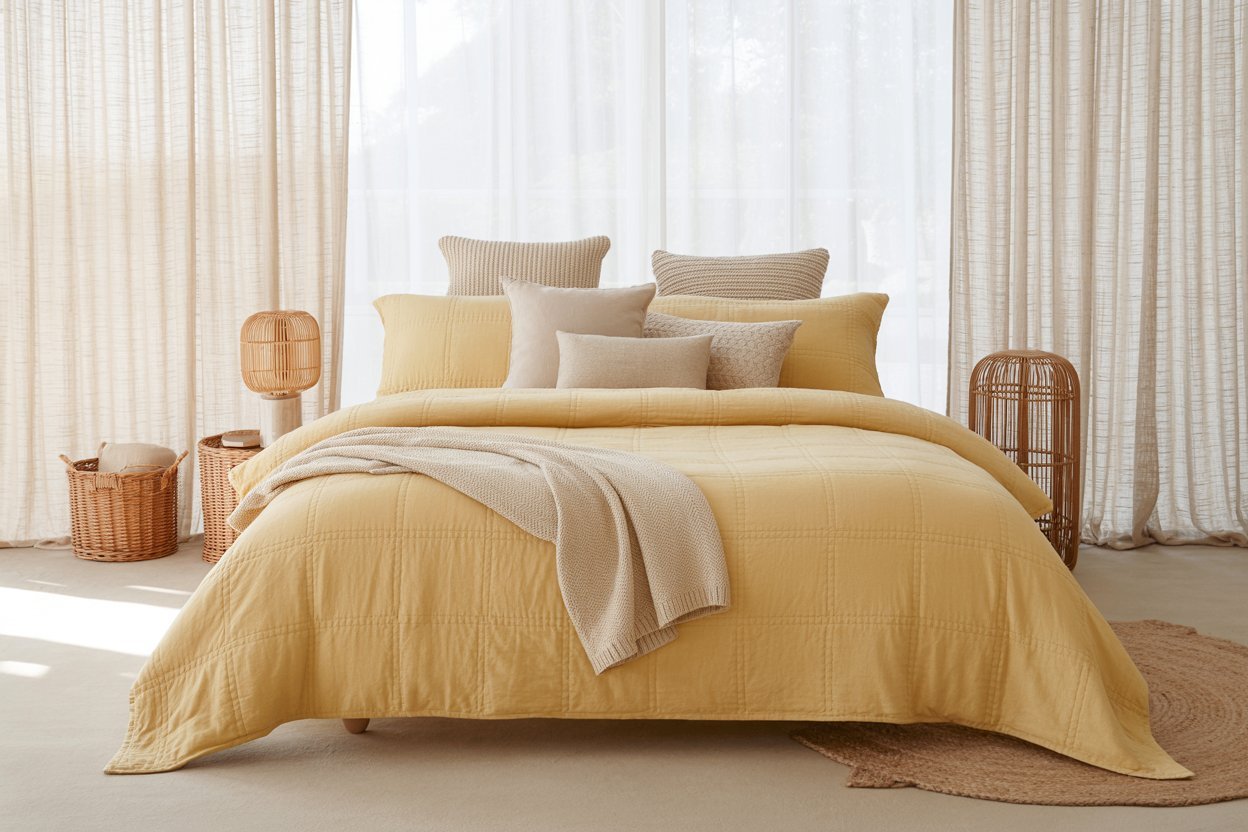
Butter Yellow works well in many rooms. It can brighten up living rooms, kitchens, and bedrooms. In living rooms, it can add color to furniture or walls.
In kitchens, it’s perfect for appliances, cabinets, or a bold backsplash. For bedrooms, it makes the space cheerful. Use it in bedding, curtains, or wall paint.
Accents and Textiles
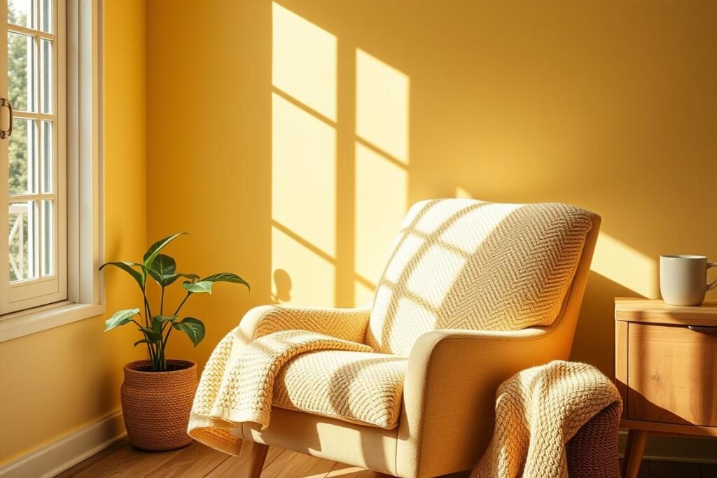
Want to try Butter Yellow without a big change? Use it in accents and textiles. Add throw pillows, blankets, or a bold piece of furniture.
You can also use it in vases, wall art, or rugs. Just remember to balance it with neutral colors.
Here are some ways to add Butter Yellow accents:
- Use yellow ceramics or glassware in your kitchen or dining area.
- Add yellow throw blankets or pillows to your living room or bedroom.
- Include yellow artwork or prints in your decor.
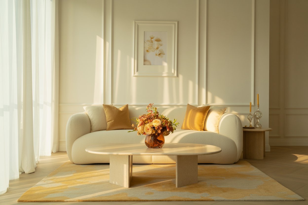
By adding Butter Yellow to your home, you’ll make it warmer and more joyful. Your spaces will feel more inviting and happy.
Aura Indigo: Deep, Sophisticated Color
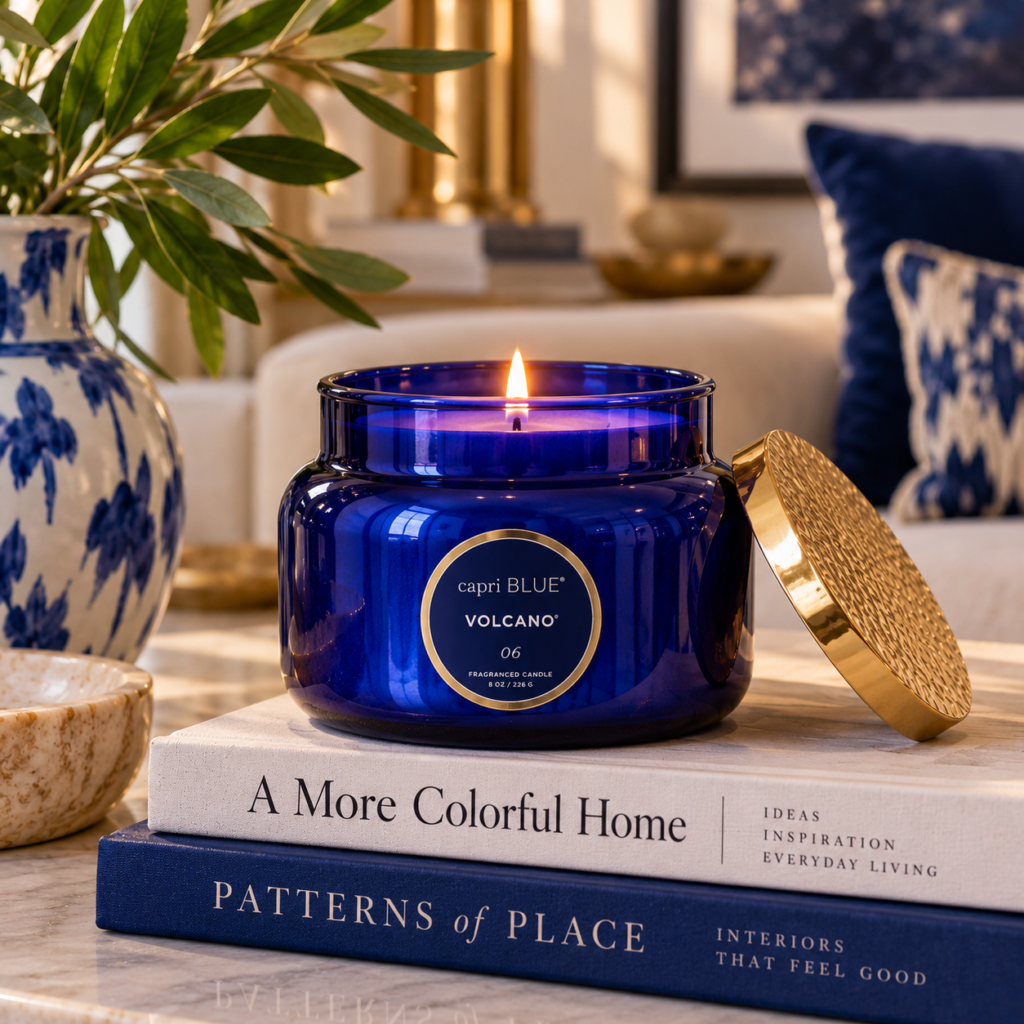
Aura Indigo is a stunning color for 2025. It brings a mystical and emotional depth. This color is more than just a sight; it changes how we feel and see spaces.
The Spiritual and Emotional Qualities
Aura Indigo is special for its spiritual and emotional sides. It helps us relax and think deeply. It connects us to ourselves and our world.
Some key emotional benefits of Aura Indigo include:
- Reduced stress and anxiety
- Enhanced introspection and self-awareness
- A sense of calm and relaxation
Creating Sophisticated Spaces
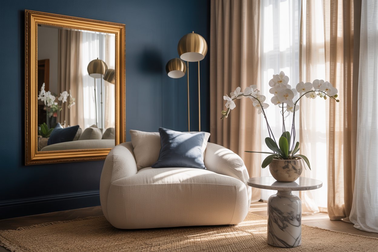
To make spaces look fancy with Aura Indigo, pair it with neutral colors or metallics. This mix makes any room feel more upscale and modern.
For example, Aura Indigo on a big wall or in decor like vases and pillows adds class.
Indigo in Artwork and Decorative Elements
Aura Indigo is great in art and decor, adding depth and feeling. Think about indigo paintings or sculptures as room highlights.
Here are some ways to use Aura Indigo in decor:
- Use indigo glassware or ceramics
- Add indigo textiles, like throw blankets or rugs
- Put indigo accents in lighting
In short, Aura Indigo is a color that makes any space look and feel better in 2025.
Dill Green: Bringing Nature Indoors
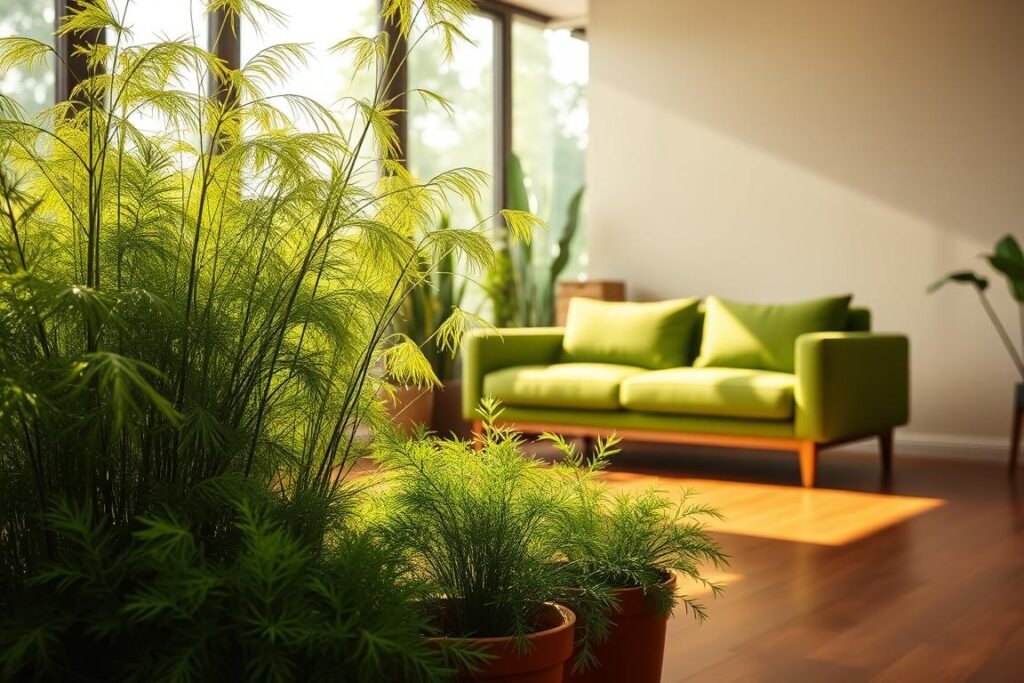
Dill Green is a fresh color for 2025. It brings nature’s calm into our homes. This color is more than a trend; it’s a way to feel connected to nature indoors.
The Biophilic Benefits of Dill Green
Dill Green is not just a color; it’s an experience. It promotes well-being and reduces stress by bringing nature inside. Being near nature, or nature-like colors, makes us feel better.
This design trend is growing, with Dill Green leading the way. Using this color in our homes makes them look good and feel good for us.
Dill Green in Different Home Environments
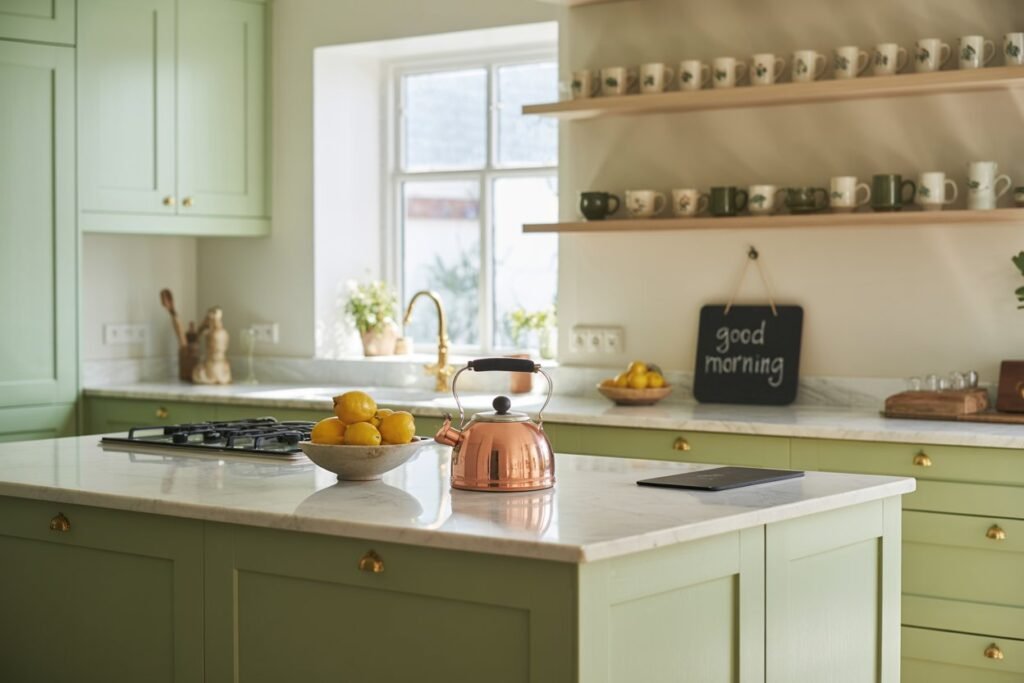
Dill Green fits well in many rooms, like bedrooms and living rooms. In bedrooms, it helps us relax. In living areas, it brings freshness and energy.
Think about the look you want when using Dill Green. For a soft look, use it as an accent or in accessories. For a bold look, choose it for big furniture or walls.
Combining Dill Green with Natural Materials
To make Dill Green feel more natural, pair it with natural materials. Wood, stone, and fibers work well with it, making spaces feel organic.
For example, a Dill Green wall with wooden furniture feels cozy. Natural textiles like linen or cotton in Dill Green add warmth and depth.
By choosing Dill Green and natural materials, we make spaces that reflect nature. These spaces also help us feel calm and well.
Alpine Oat: The New Neutral Foundation
As we explore the 2025 color palette, Alpine Oat stands out. It’s changing how we see neutral colors. This color is more than a trend; it’s a big change in home color choices.
Why Alpine Oat is Replacing Traditional Neutrals
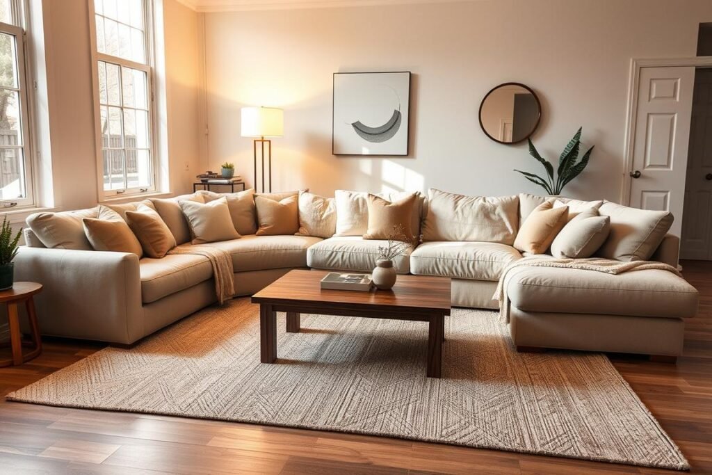
Alpine Oat is becoming a favorite neutral because it’s warm yet subtle. It’s different from old neutrals that can feel cold. Alpine Oat adds coziness and depth to any room.
It works well with both bold and soft colors. This makes it perfect for many design styles.
Using Alpine Oat as a main color makes adding 2025’s bold colors easier. It keeps the room calm, even with bold colors.
Using Alpine Oat as a Base for Bold Colors
Alpine Oat pairs well with 2025’s bold colors like Cherry Red and Aura Indigo. It balances these colors, so they don’t overwhelm.
- Use Alpine Oat on walls and big furniture for a neutral base.
- Add bold colors with throw pillows, rugs, and art.
- Try different shades of Alpine Oat to match your space.
Alpine Oat in Furniture and Major Elements
You can use Alpine Oat in furniture and big parts of your home. This includes upholstery, cabinets, or flooring. It makes your space look good and feel right.
An Alpine Oat sofa can be a stylish centerpiece in a living room. Alpine Oat cabinets can make a kitchen warm and fancy.
Choosing Alpine Oat as a neutral lets homeowners create a welcoming space. It’s ready for 2025’s bold colors.
How to Bring Bold Color Into Your Home
Exploring the 2025 color palette is exciting. It’s key to mix new colors with what you already have. This way, you can update your home without starting over.
Working with Existing Furniture and Decor
Start with the colors and materials you already own. If your furniture is mostly neutral, introduce Cherry Red or Butter Yellow through one or two high-impact pieces instead of scattering small accents everywhere.
Use the 60-30-10 rule to keep things balanced. This means 60% of the room is one color, 30% another, and 10% an accent. It makes it easier to follow color trends.
Budget-Friendly Color Updates
Changing your home’s colors doesn’t have to cost a lot. Here are some ways to do it affordably:
- Paint one wall in a bold 2025 color to create a focal point.
- Use colorful throw pillows, blankets, and rugs to add pops of color.
- Incorporate 2025 colors into your artwork and decorative elements.
How to Adapt the Palette by Season
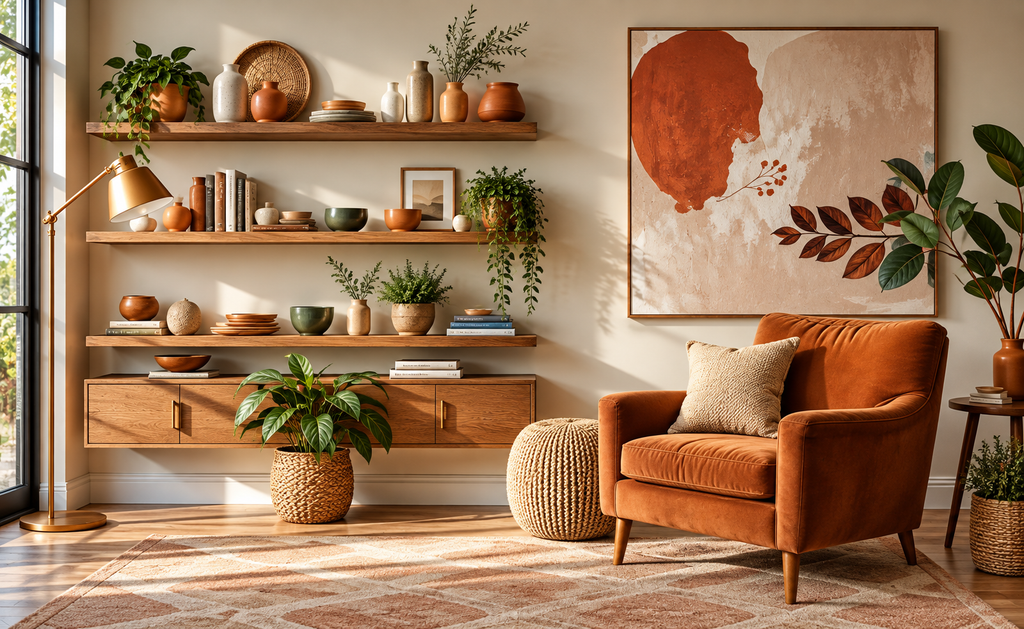
You can shift the same palette through the seasons. Use lighter versions of Aura Indigo in spring and summer, then move toward deeper indigo, burgundy, forest green, and warm oat tones in fall and winter.
How to Mix Multiple Bold Colors Harmoniously
To mix colors well, pick a main color and then choose two colors that go with it. For example, pair Dill Green with Alpine Oat for a soothing look. Try different mixes to find what works best for you.
By following these tips, you can make your home look great with the 2025 colors. It will show off your style and help you manage color overload.
Colorful Decor Picks That Add Impact Without the Clutter
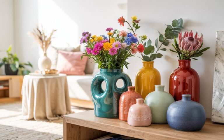
You do not need to repaint an entire room to try a stronger palette. A rug, tactile throw, sculptural vase, graphic pillow, or saturated glass accent can bring in color while keeping the larger scheme controlled. These picks work especially well when the rest of the room is grounded with warm wood, cream, oat, or soft beige.
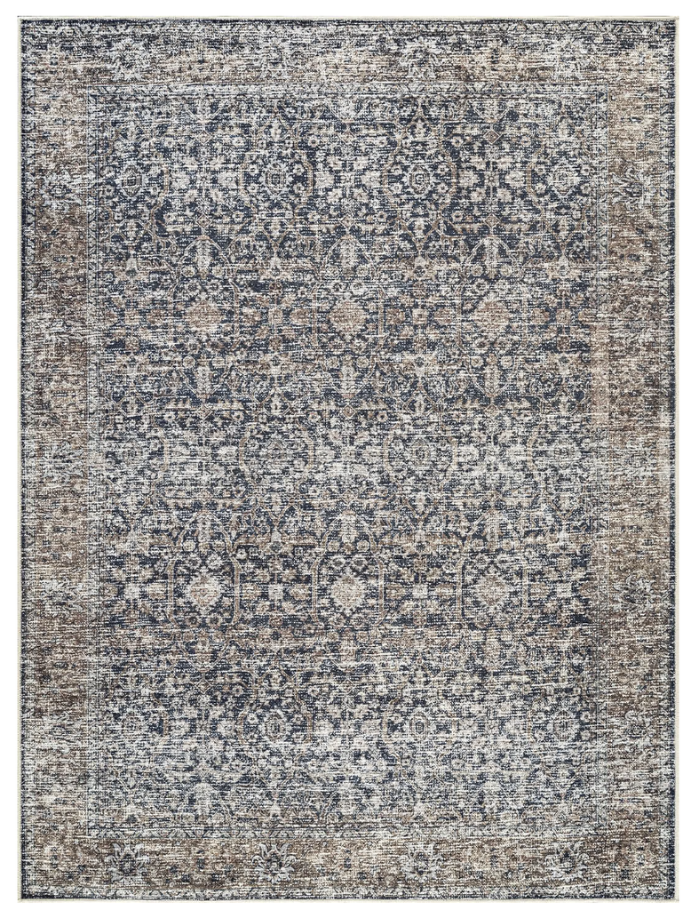
Bloom Rugs Caria Washable Rug
A patterned blue-and-tan rug is an easy way to introduce indigo and warmer supporting tones in one move. It works particularly well in a neutral living room where you want more depth without committing to a dark wall. See the Bloom Rugs Caria options on Amazon.
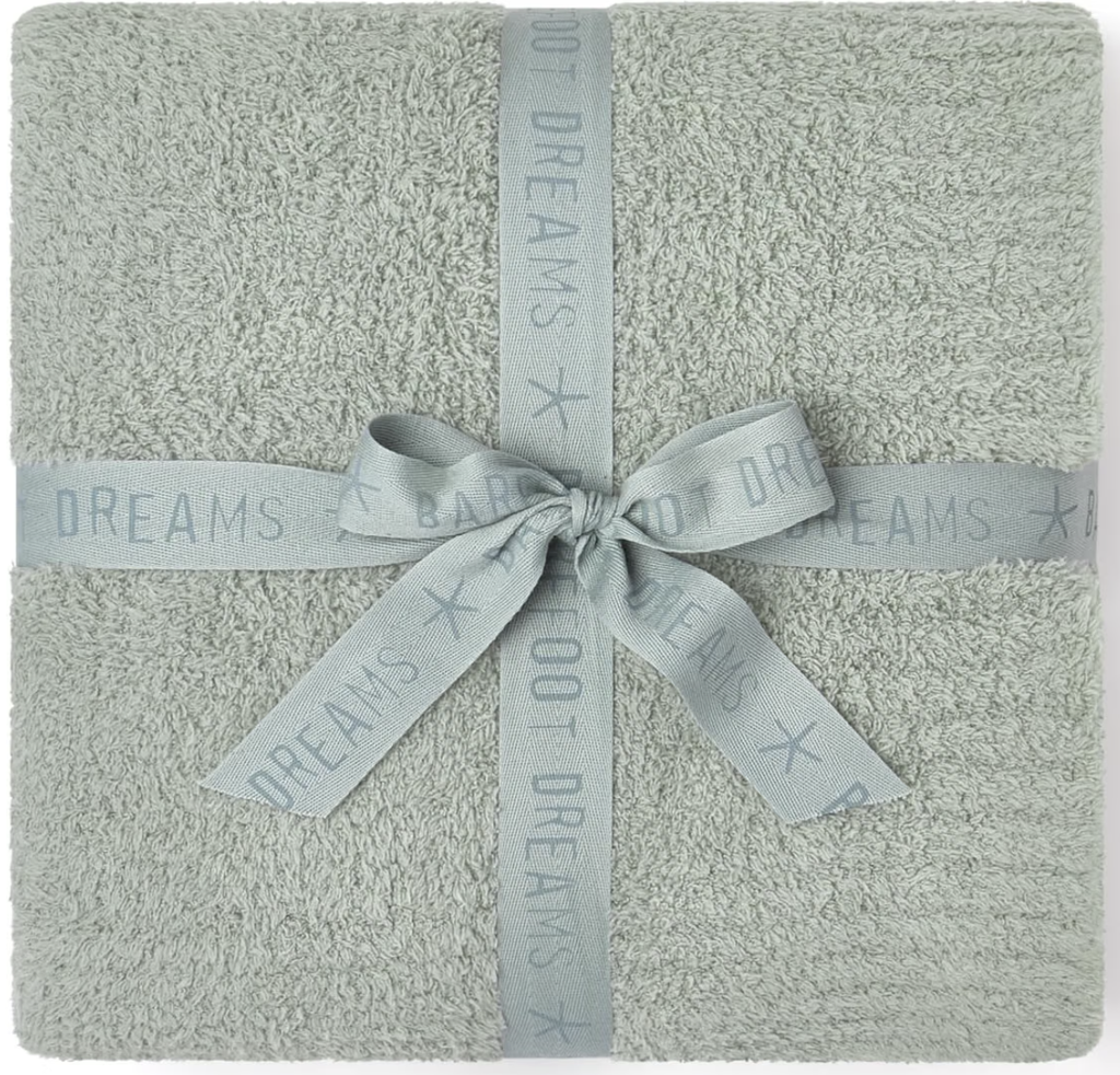
Barefoot Dreams CozyChic Throw
When the room already contains several strong colors, texture can do as much work as another accent hue. This plush throw is a useful warm-neutral layer for balancing Cherry Red, Indigo, or Dill Green while still making the room feel finished. Explore the CozyChic Throw on Amazon.
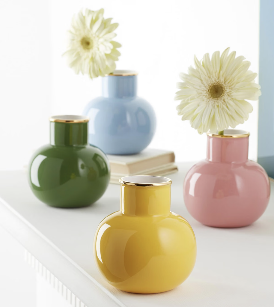
Kate Spade Make It Pop Vase
A small sculptural vase in a confident green is a good example of using one concentrated accent instead of multiple tiny accessories. Place it against an oat, cream, walnut, or navy backdrop so the color feels intentional. See the Make It Pop Vase on Amazon.
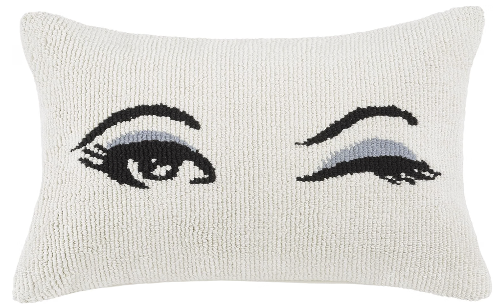
Kate Spade Wink Decorative Pillow
If you prefer a playful maximalist look, a single graphic pillow can create a stronger focal point than a sofa covered in mismatched cushions. Pair it with solid-color upholstery and repeat one shade elsewhere in the room. See the Wink pillow on Amazon.
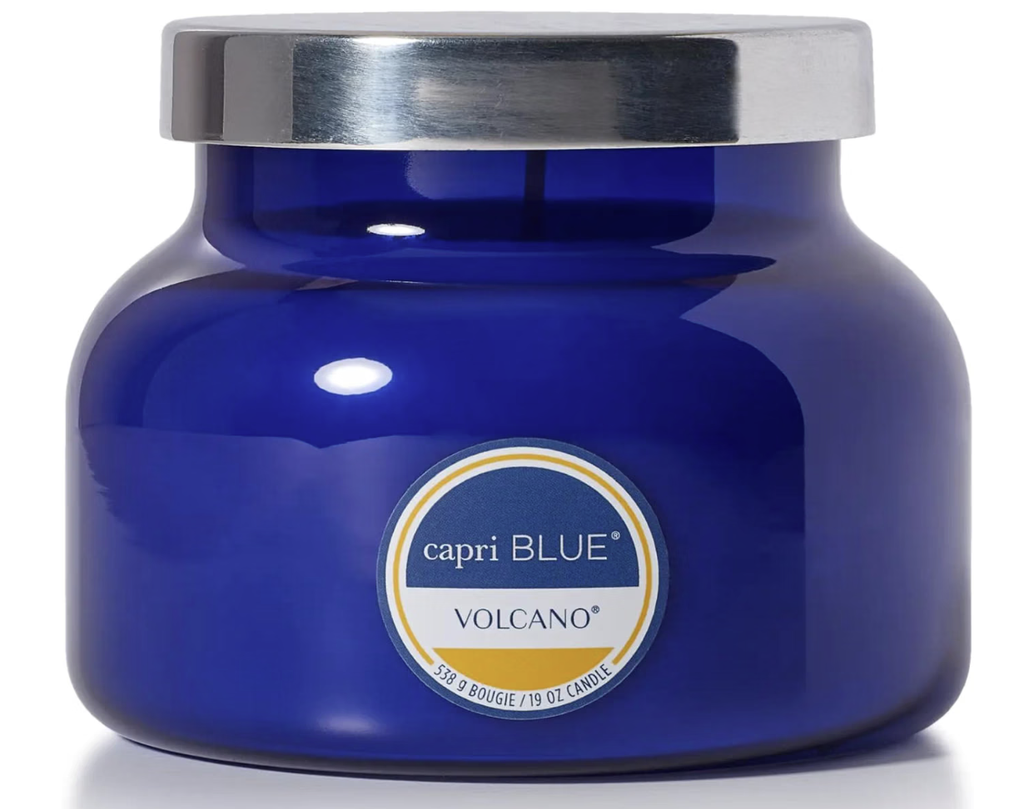
Capri Blue Volcano Candle
The cobalt-blue glass jar doubles as a compact indigo accent on a coffee table, shelf, or bedside table. It is especially useful when you want to repeat a blue note from artwork or a rug without adding another large patterned piece. See the Capri Blue Volcano candle on Amazon.
Affiliate note: As an Amazon Associate, GlowNestBlog may earn from qualifying purchases.
Final Thoughts: Make Bold Color Feel Intentional
We’ve looked at the 2025 color palette together. It shows how colors can change your home. Colors like Cherry Red and Alpine Oat can make your space unique.
Using these colors in your home makes it stylish and shows who you are. Whether you want something new or bold, 2025 has it. Try mixing these colors to make your home special.
Embracing 2025 colors is fun and lets you show your style. With these trends, your home can look new and personal.