14 MCM Bathroom Ideas With Unexpected Color and Retro Character
Mid-century modern bathrooms can be quietly architectural or gloriously colorful. The most interesting ones borrow the era’s clean cabinet lines and compact tile shapes, then add a color combination you would never find in an all-beige mood board. These 14 MCM bathroom ideas are written as distinct design concepts, from a cobalt checkerboard floor to a burgundy tile wall with a butter-yellow mirror.
Where to start: Choose one hero element, such as a colored tile wall, a dramatic vanity or a striped shower curtain. Let the remaining materials give it room. You can borrow a palette from these ideas without renovating the entire bathroom.
For a playful MCM bathroom, try pistachio + cobalt, apricot + lilac, or burgundy + butter yellow. For a calmer room, try walnut + graphite or sea-glass green + cedar.
14 MCM bathroom ideas with an unexpected twist
1. The pistachio-and-cobalt checkerboard
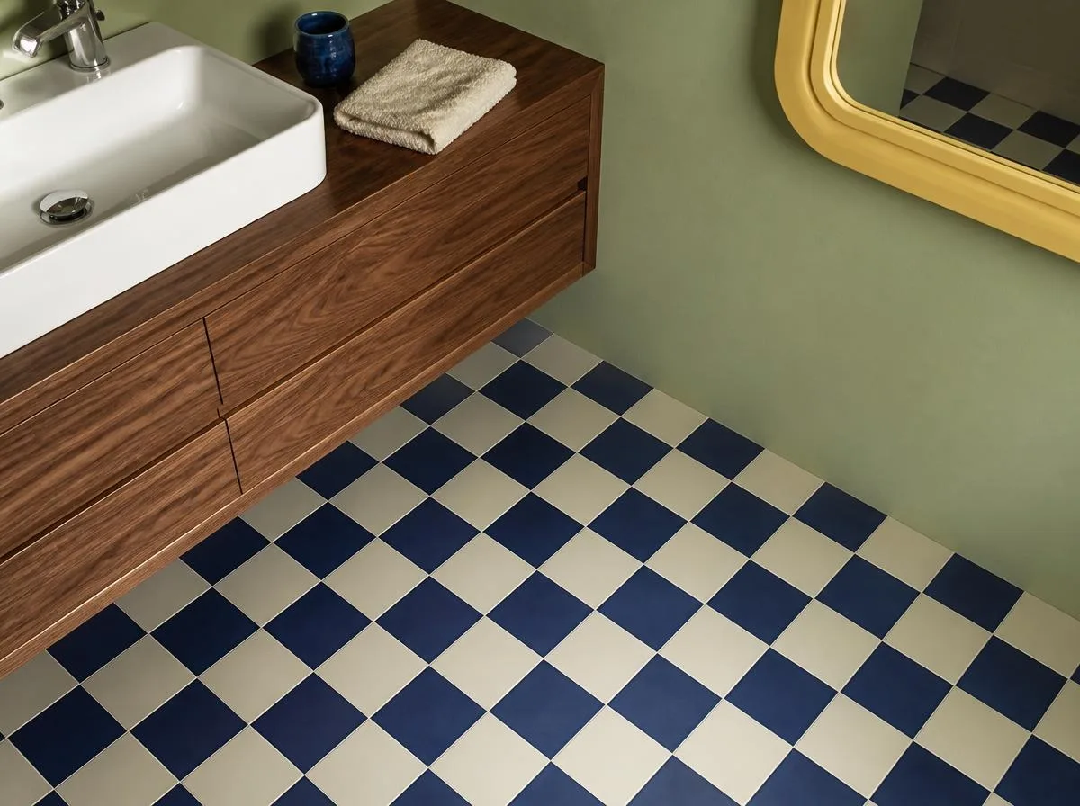
Palette: pistachio, cobalt, butter yellow.
Paint the upper walls a soft pistachio. Use cobalt-and-cream checkerboard floor tile as the one loud gesture, then add a low walnut vanity and a butter-yellow framed mirror. The clash is intentional: small squares beneath a broad, simple cabinet give the room a playful rhythm without filling every surface with pattern.
Best for: a powder room or a small hall bathroom. Keep the shower walls plain and repeat the cobalt in only one small accessory.
2. A terracotta sunken-sunrise shower
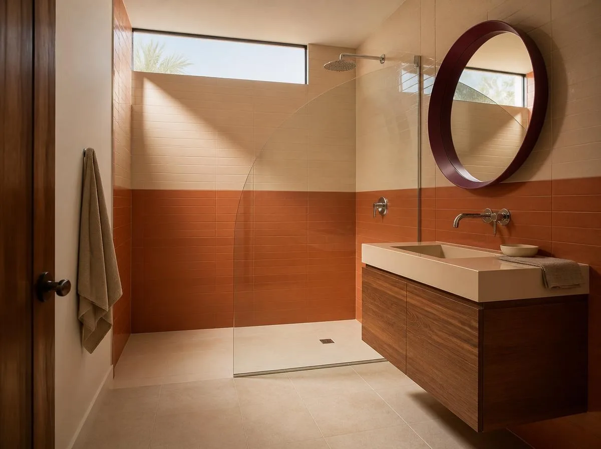
Palette: burnt orange, sand, smoky plum.
Imagine a shower wall divided into two flat color fields: clay-orange tile below and pale sand above, with a single plum circular mirror nearby. A curved shower screen echoes a sunrise without requiring a novelty sun motif. Use matte finishes for the large planes and polished chrome for the smaller fittings.
Best for: a remodel where the shower can be the statement. Check tile suitability and waterproofing with the installer before selecting decorative formats.
3. The olive-and-oxblood hotel bathroom
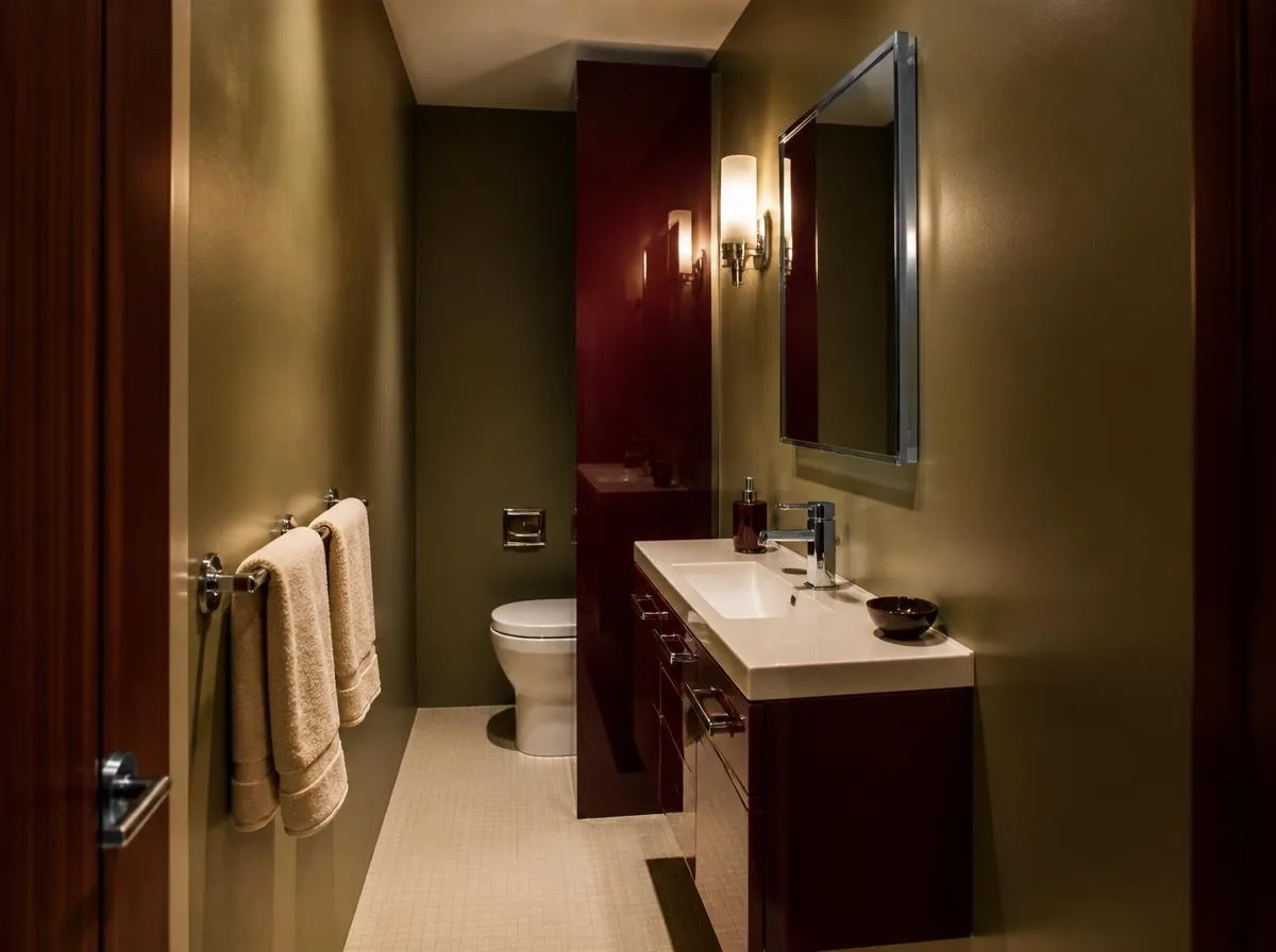
Palette: olive, oxblood, champagne.
Give a narrow bathroom the feeling of a small vintage hotel. Olive-painted walls, an oxblood lacquered vanity and champagne-colored towels make an unusual but coherent trio. A slim chrome rail and a rectangular medicine cabinet keep the practical details crisp.
Best for: renters who can repaint a vanity with permission, or homeowners replacing cabinetry rather than tile.
4. Blue tile with a burnt-orange ceiling
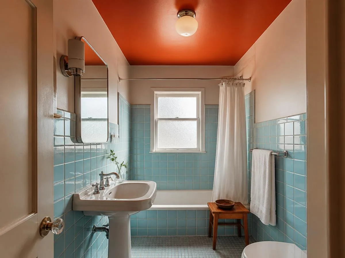
Palette: powder blue, paprika, warm white.
Keep existing powder-blue wall tile and make the ceiling the surprise: a deep paprika or burnt-orange paint that draws the eye upward. A white sink, chrome hardware and a modest teak stool stop the palette from feeling busy. Test the ceiling paint in both morning and evening light.
Best for: vintage bathrooms with sound blue tile. Use bathroom-rated paint and account for moisture before painting.
5. The atomic-constellation powder room
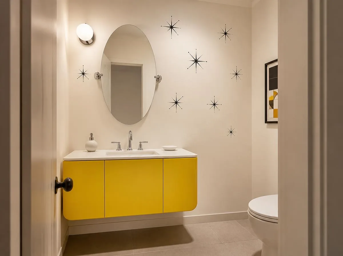
Palette: ink black, ivory, citron.
Use an ivory wall with a sparse, hand-drawn-looking constellation of small black starbursts. Choose a citron-yellow vanity or narrow wall shelf, then keep the floor almost silent. A single graphic print can achieve the effect without themed wallpaper on every wall.
Best for: a windowless half bath where the pattern is viewed up close.
6. A pink-and-forest-green tile handshake
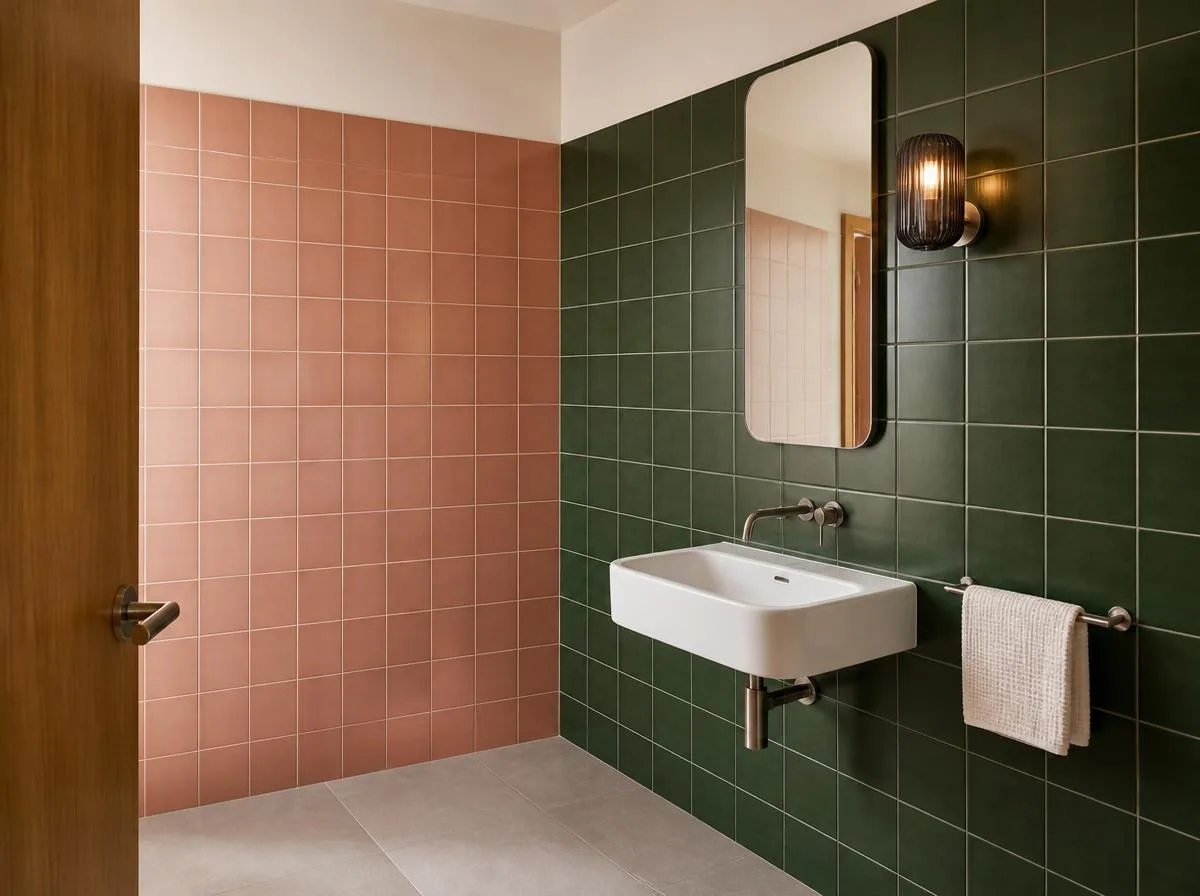
Palette: salmon pink, pine green, brushed nickel.
Put salmon square tile on one short wall and dark forest-green tile on an adjoining wall. Let the two colors meet at the corner rather than blending them into a fussy mosaic. A smoked-glass sconce and a simple white basin give the bold junction breathing space.
Best for: rooms with a clearly defined vanity wall. Sample the two tiles together under the actual bulbs before ordering.
7. The walnut vanity that looks like a record console
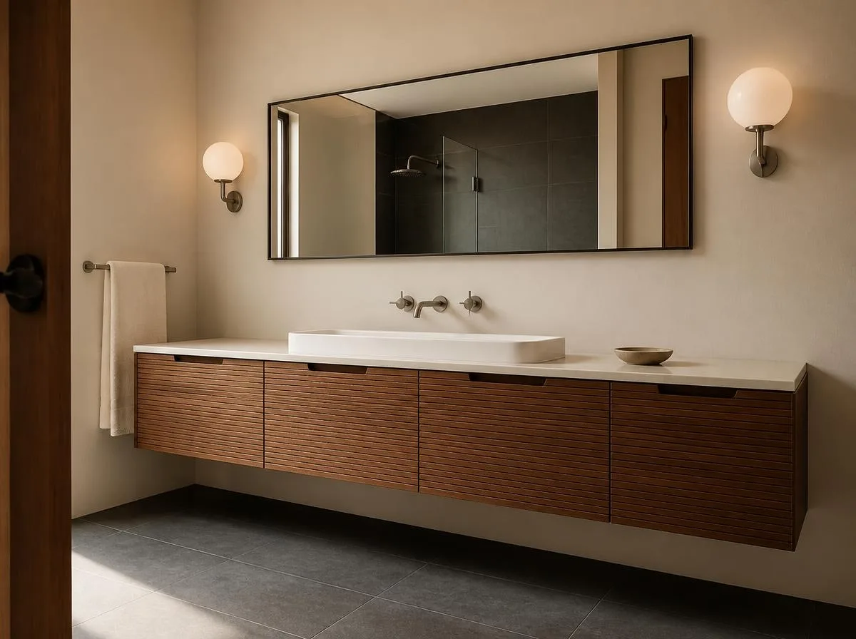
Palette: walnut, cream, graphite.
A wall-mounted walnut vanity with fine horizontal grooves can look like a beautifully proportioned record cabinet. Pair it with a long horizontal mirror, two modest opal globe lights and a graphite floor. Hide daily clutter in deep drawers so the furniture shape stays visible.
Best for: a primary bathroom needing serious storage. Specify bathroom-appropriate cabinetry and protected edges rather than reusing untreated furniture near water.
8. An apricot-and-lilac guest bath
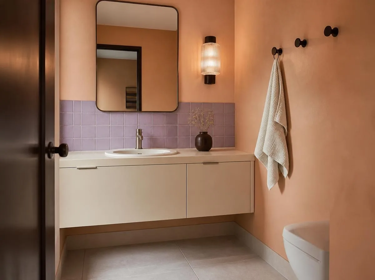
Palette: apricot, lilac, cocoa.
An apricot-painted wall, one lilac tiled backsplash and cocoa-brown hooks make a surprisingly gentle retro palette. Keep the basin and countertop creamy, and add a ribbed glass shade to scatter the light. The two pastel colors should be slightly dusty, not sugary.
Best for: compact guest bathrooms where a single wall can carry the entire design.
9. The Japanese-influenced cedar and sea-glass room
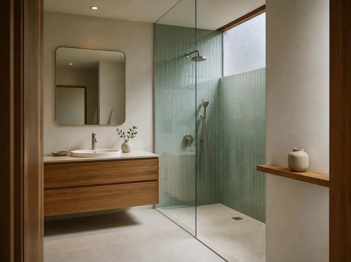
Palette: cedar, sea glass, stone.
Borrow the restraint of Japanese interiors while keeping the slender lines of midcentury furniture. Use a floating cedar-look cabinet, sea-glass green vertical tile in the shower and a pale stone-colored floor. A simple wooden ledge for one ceramic vessel feels more purposeful than a cluster of decorative objects.
Best for: a calmer MCM aesthetic. Choose materials designed for high humidity and avoid untreated wood in splash zones.
10. Burgundy tile with butter-yellow details
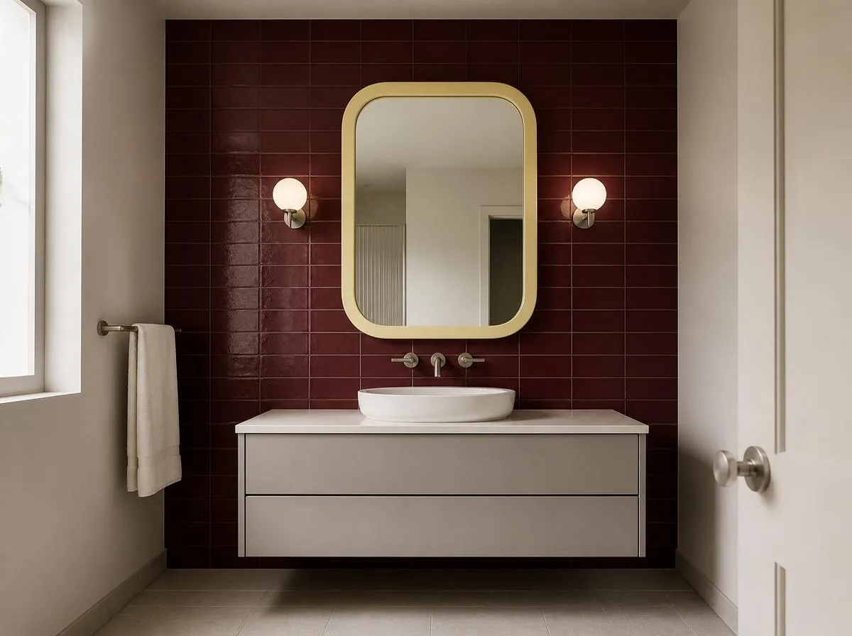
Palette: burgundy, butter yellow, pale gray.
Try burgundy tile only behind the vanity, from counter to ceiling. A pale-gray floor keeps the deep color readable, while a butter-yellow mirror frame, toothbrush cup or towel provides a small jolt of optimism. Avoid repeating the yellow everywhere: one strong detail is better.
Best for: a sink wall with enough natural or well-planned artificial light.
11. A terrazzo floor with a color-picked vanity
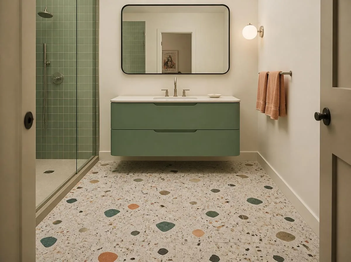
Palette: peach, jade, charcoal.
Instead of matching the vanity to the main wall color, pick one minor fleck from the terrazzo and amplify it. A terrazzo floor with peach, jade and charcoal fragments becomes the palette key for a jade vanity, peach hand towels and a charcoal frame. Keep the wall a warm off-white.
Best for: renovations with a new floor. Order a real tile sample and check slip resistance for wet applications.
12. The striped-shower-curtain apartment bathroom
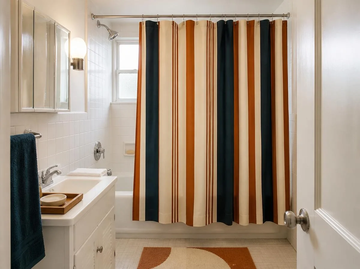
Palette: cream, rust, dark teal.
A rental bathroom can carry an MCM story through one oversized striped shower curtain. Choose uneven vertical bands in cream, rust and dark teal, then add a teak-look tray, a geometric bath mat and an opal-glass-look wall accessory that does not require rewiring. Keep existing white tile as a clean backdrop.
Best for: renters and low-budget makeovers. Use removable fittings only where permitted and reliable.
13. The glass-block glow corner
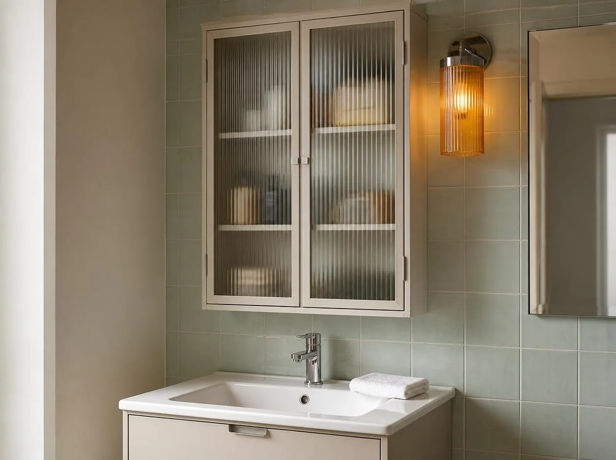
Palette: amber, pale mint, warm white.
Use a compact glass-block panel as a privacy screen or borrowed-light feature, then place pale mint tile and amber accents nearby. The glass provides texture without another printed pattern. For an easier adaptation, use a fluted-glass cabinet door instead of changing a wall.
Best for: renovations where a professional can assess framing, waterproofing and privacy.
14. The gallery-wall bathroom with a single giant print
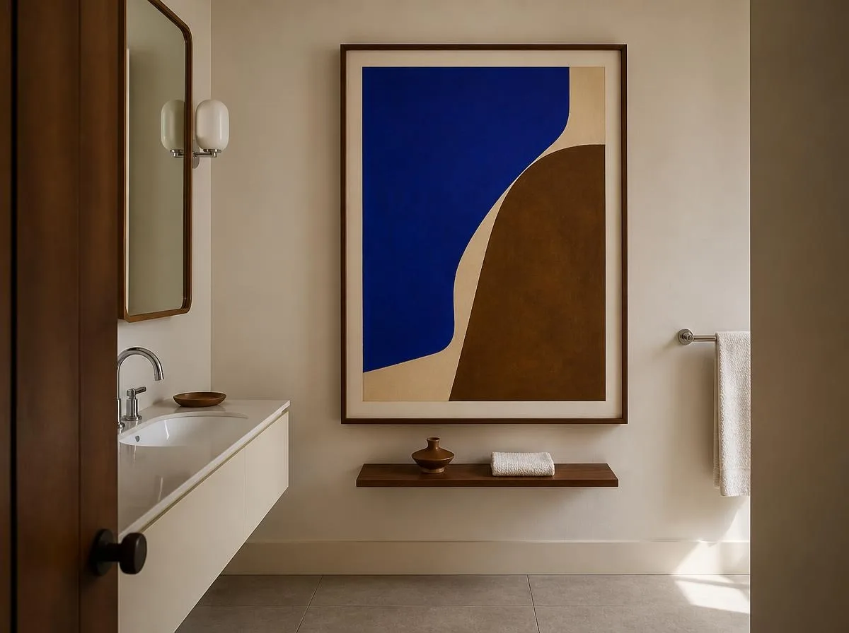
Palette: cream, tobacco, Klein blue.
Treat the wall opposite the vanity like a tiny gallery. Hang one oversized abstract print in tobacco brown and brilliant blue inside a moisture-appropriate frame. Support it with a plain cream room and a narrow vintage-inspired wood shelf. One large artwork reads more confidently than five unrelated little frames.
Best for: a dry wall away from direct splashes. Keep paper art out of persistent condensation unless properly protected.
How to choose a mid-century modern bathroom color palette
If your bathroom already has original colored tile, start with that. A pink, blue or green vintage fixture can be an asset rather than a problem to conceal. Midcentury bathrooms commonly used coordinated colored tile and fixtures; by the 1970s, earthier tones and patterns had become more prominent. Architectural Digest’s tile history offers a useful overview.
For a room with no original features, choose one dominant color, one supporting material and one small contrast. For example, use 70% creamy wall and ceiling surfaces, 25% green tile and wood, and a 5% orange accent. Those proportions are a design exercise, not a technical rule, so adjust them to the room’s layout.
| Mood | Palette | Make it work |
|---|---|---|
| Playful atomic | Citron, black, ivory | One graphic motif and otherwise simple fixtures |
| Warm 1970s | Terracotta, sand, plum | Matte tile, a rounded mirror and warm lighting |
| Quiet architectural | Walnut, graphite, cream | A long vanity and practical concealed drawers |
| Colorful vintage | Salmon, pine green, chrome | Two solid tile planes rather than tiny mixed patterns |
MCM bathroom decor that works without remodeling
Start with the pieces people notice at eye level. A sculptural mirror, one unusually colored bath mat, a wide striped shower curtain or a large abstract print can change the room’s mood in an afternoon. For more functional changes, swap ordinary hooks for a coordinated set and keep the medicine cabinet working hard behind a simple front. Our guide to small bathroom organization ideas offers storage options that don’t require a larger room.
Light deserves equal attention. Globe sconces are a familiar midcentury shape, but a single dramatic fixture will not necessarily illuminate a face evenly. The National Kitchen & Bath Association’s lighting guidance recommends adequate task lighting at the mirror alongside general lighting. Have a qualified electrician select fixtures appropriate for their bathroom location.
Before you remodel: four practical checks
- Keep sound vintage elements when possible. If the original tile is in good condition, test new paint, lighting or textiles around it before deciding to demolish it.
- Check moisture performance. Decorative wood, wallpaper, finishes and lighting must suit their exposure zone. A bathroom exhaust system should vent outdoors; consult local rules and a professional on sizing.
- Check flooring under wet conditions. Ask for slip-resistance information and tile suitability, especially for shower floors.
- Plan the storage first. Measure toiletries, cleaning supplies and drawer clearances before choosing a sculptural vanity. Beautiful furniture is frustrating if it has nowhere to put a hairdryer.
The NKBA bathroom planning guidelines cover clearance, lighting, ventilation, accessible design and material selection. For a remodel, those practical requirements should be resolved before the final tile layout is approved.
FAQ: mid-century modern bathroom design
What makes a bathroom MCM?
Mid-century modern bathroom design typically emphasizes straightforward cabinet lines, geometric or compact-format tile, clean fixtures, and a deliberate balance between warm material and bold or muted color. A room can reference the period without copying it exactly.
Can a small bathroom use dark colors?
Yes. Try dark color on one vanity or one short wall, then keep the mirror large and pay close attention to lighting. Deep green and burgundy can feel intimate rather than cramped when the layout stays uncluttered.
How can I get an MCM bathroom in a rental?
Choose reversible elements first: a graphic shower curtain, bath mat, framed print, towels and countertop accessories. Check the lease before painting or attaching hardware.
What lighting looks midcentury?
Opal globes, slim linear sconces and uncomplicated metal fittings suit the look. Choose them based on useful illumination, electrical safety and placement around the mirror.
Are 1970s bathrooms the same as mid-century modern?
They overlap, but they aren’t identical. Mid-century modern is a broader design vocabulary; 1970s bathrooms often lean more toward earth colors and expressive pattern. Mixing a 1970s palette with a clean-lined MCM vanity is a perfectly workable contemporary interpretation.
More home color and vintage inspiration
For bolder ways to combine hues in another hard-working room, see our guide to 15 kitchen color combinations. If you enjoy blending old pieces with new ones, explore vintage eclectic decor ideas.
Editorial note: The 14 rooms above are original styling concepts and suggested combinations, not photographs of completed projects or claims of hands-on product testing. Material choices and installation methods should be checked for the specific bathroom. Background references: Architectural Digest, NKBA planning guidelines.