How to Choose Kitchen Colors: 15 Bold Combinations That Actually Work
You love the cobalt kitchen in a photograph. Your own kitchen has honey-colored flooring, a speckled countertop you cannot replace and one window facing a brick wall. A copied cabinet color won’t look the same in your room, because your light and materials are different.
To choose kitchen colors that work at home, start with the finishes you are keeping. Give the strongest color a place, then check it at breakfast and under the evening lights. An orange stool may be all the second color you need.
Compare the 15 palettes below, or start with the palette-selection table to narrow the choices around your countertop, light and room size.
What kitchen-color research says about bold choices
Wood led cabinet choices at 29%, followed by white at 28%, in the 2026 U.S. Houzz Kitchen Trends Study. The study covered 1,780 homeowners on Houzz with recent, current or planned renovations. The NKBA’s 2026 professional forecast favored blues and greens and pointed to islands and backsplashes as places for statement color; bright orange and red ranked much lower.
The newer NKBA 2027 report, released October 14, 2026, draws on 830 North American industry professionals. Its public overview emphasizes personal, layered design and simpler choices. The homeowner survey and the professional forecasts cover different groups, and the 2027 color tables sit behind a paid or member wall.
These palettes lean bolder, with cherry, violet and fuchsia. A small painted area or one piece of furniture lets you enjoy those shades next to wood and quieter surfaces.
How to choose kitchen colors around the finishes you are keeping
Read the whole countertop, not one attractive fleck
Clear a section of counter and place paint samples against it. Stand back until the pattern reads as a whole. Cream, charcoal and tiny red flecks may blend into warm brown from the doorway. Matching that small red fleck can make the cabinets feel disconnected from the room.
Include the floor, backsplash and appliance finish in the same view. A crisp white chip helps reveal a yellow, pink or gray cast; put it away once you have spotted the undertone and judge the materials together. If the counter and backsplash already clash, try a plain backsplash sample before adding another strong color.
Separate brightness from saturation
Persimmon, lemon and clear lilac are vivid but lighter than burgundy or aubergine. If a deep shade loses its color in the darkest corner, compare a lighter version or reduce the area it covers.
Check the actual paint’s light reflectance value (LRV) with the manufacturer. It helps compare lightness, while sheen, texture and lighting affect how the finished surface looks.
Give the second color a smaller job
Choose the main painted area first: lower cabinets, island, pantry or wall. Put the second hue on seating, a recess or a smaller piece. Use 60–30–10 as a rough sketch if it helps; the balance will depend on what you can see from the doorway.
In a galley, one colored lower run may be enough. In an open-plan room, check the island from the sofa too. The kitchen–living room layout guide covers those shared views. For help with proportions, see how to mix bold colors without color overload.
Choose your starting palette: a four-filter selection table
Use the filters in this order: countertop → light → room scale → style. Use the table to pick two contenders, then compare them with your actual slab.
Apply the four filters in order
- Countertop: find the closest material description. Busy warm granite needs a quieter backsplash; black counters need a deliberate contrast check. With dramatic veining, remove an extra floor pattern before adding another color.
- Light: assess the darkest cabinet run during meal preparation. If you cannot distinguish the deep color there, move it to an accent or choose a lighter sample.
- Scale: a compact kitchen is one where cabinet faces dominate your view. Use less deep color when you want an airy effect. You can also choose an intentionally enveloping room.
- Style: shortlist two palettes you would enjoy with the existing door profile and architecture. Assign each color to a surface before choosing paint.
Shortlist palettes for your existing countertop
| Countertop you are keeping | Size and lighting | Style | Start with | Placement or override |
|---|---|---|---|---|
| Plain white or pale cool gray | Compact; low to moderate light | Graphic modern | 1. Cobalt + tangerine or 7. Violet + mint | Color the lowers only; keep upper walls light. Test the blue/violet in shadow. |
| Plain white or black | Small; limited daylight | Retro | 3. Cherry + powder blue | Pale-blue main cabinets; red pantry or trolley. With black counters, keep the upper half pale. |
| Pale fine-chip terrazzo | Medium; good daylight | Coastal or airy modern | 2. Turquoise + coral or 13. Persimmon + lilac | Check the chips’ undertones. Choose a plain backsplash; reduce the accent if chips are large or colorful. |
| Busy tan or gold granite | Compact to medium; any light | Eclectic or contemporary | 8. Deep teal or 1. Cobalt, initially alone | Sample against the whole slab. Omit the orange accent initially and keep the backsplash simple. |
| Warm cream or restrained warm stone | Medium to large; good light | Art Deco or traditional | 5. Saffron + aubergine or 14. Forest + scarlet | Use the second hue in one nook or alcove. Pink cream needs a separate undertone test. |
| Concrete-look or quiet cool gray | Medium to large; moderate light | Industrial | 11. Peacock + copper | Light the worktop well; compare copper with brick and flooring. Strong pink-gray counters need extra testing. |
Compare room styles and darker countertops
| Countertop you are keeping | Size and lighting | Style | Start with | Placement or override |
|---|---|---|---|---|
| Plain pale counter; walnut details | Medium; moderate to good light | Mid-century | 12. Mustard + petrol | If honey wood dominates, keep it and put mustard in chairs instead of cabinetry. |
| Quiet white or softly veined light stone | Medium to large; good light | Maximalist | 4. Emerald + fuchsia | Choose one patterned layer. Strong stone veining replaces a patterned floor. |
| Plain light counter | Tall or medium room; good light or intentional evening mood | Immersive, layered | 9. Raspberry + burgundy | Keep a light counter; start with one raspberry wall if the ceiling is low. |
| Plain warm white; terracotta floor | Small to large; bright daylight | Mediterranean | 6. Electric blue + lemon | Blue tile is the main statement; lemon stays small. Test glare and grout. |
| Plain white; quiet flooring | Medium or open plan; good light | Geometric or expressive modern | 10. Lime + ultramarine or 15. Fuchsia + black/white | Choose one graphic pattern. Check the view from the adjoining living area. |
| Black or strongly veined dark stone | Compact or dim | Any | 3. Pale blue + red accent; accent-only versions of other palettes | Keep the main cabinets or upper zone lighter for an airy effect. Test a full door-size sample before deep-color cabinetry. |
Three ways to use the selection table
Example: small, dim kitchen + tan granite + love of modern blue
Choose either palette 1’s cobalt or palette 8’s teal as your first sample. Put large samples against the granite. Keep the existing light uppers if they suit the slab, choose a plain backsplash, and leave orange out initially. Check the blue at the sink and the darkest end at night. If it loses its color, try a lighter blue.
Example: sunny open-plan kitchen + white counter + love of bold geometry
Compare palettes 10 and 15. Give the island the main color. For palette 10, limit lime to a shelf recess; for palette 15, choose whether the floor gets the graphic pattern. View samples from the dining area with its existing furniture. Take the palette that connects best to that room into a full material test.
Example: honey oak cabinets + limited budget + mid-century style
Try palette 12 with the roles changed: retain sound oak, use petrol on a suitable wall or backsplash, and bring mustard into chairs. Buy the small trial pieces first. If the wood and mustard feel too similar, shrink the mustard area and keep the wood.
15 bold kitchen palettes, with a practical plan for each
HEX values below describe screen colors; take the codes to a supplier to shortlist paint and materials, then approve physical samples in your kitchen. Copper is shown as a flat color cue. Each strip labels the main hue, accent and supporting color.
1. Cobalt blue + tangerine: graphic contemporary
Cobalt
#2146D9
Tangerine
#F47721
Chalk white
#F5F5F0
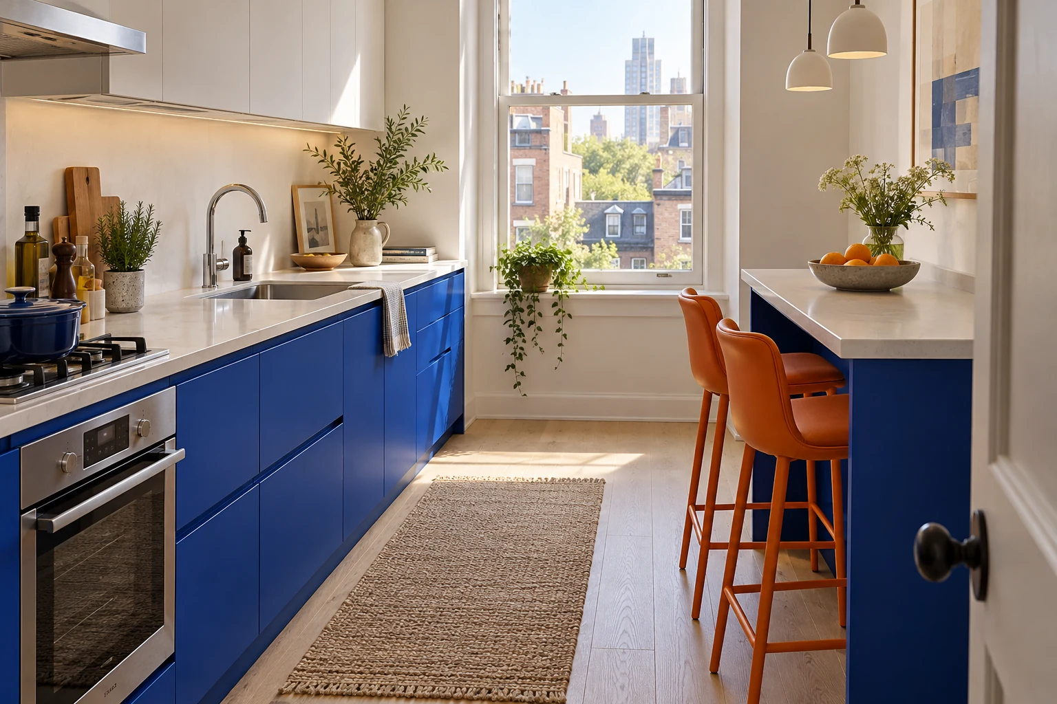
Cobalt lower cabinets give a narrow galley a clear line of color. Keep the upper wall chalk white and put two tangerine stools at the eating end. Flat doors suit the graphic scheme; brushed steel adds a quieter finish around the handles and sink.
Honey oak changes the blue you see
Place the blue board directly against the floor. A violet-leaning cobalt makes a sharper contrast with golden oak than a green-leaning blue. Look at both from the doorway, where the floor and cabinets fill the same view.
With busy tan granite, start with cobalt and a plain backsplash. The counter already brings warm color into the room. Orange seating and a large blue print let you try the pairing before painting.
2. Turquoise + coral: modern coastal
Turquoise
#087F8C
Coral
#F27068
Soft white
#F6F5EF
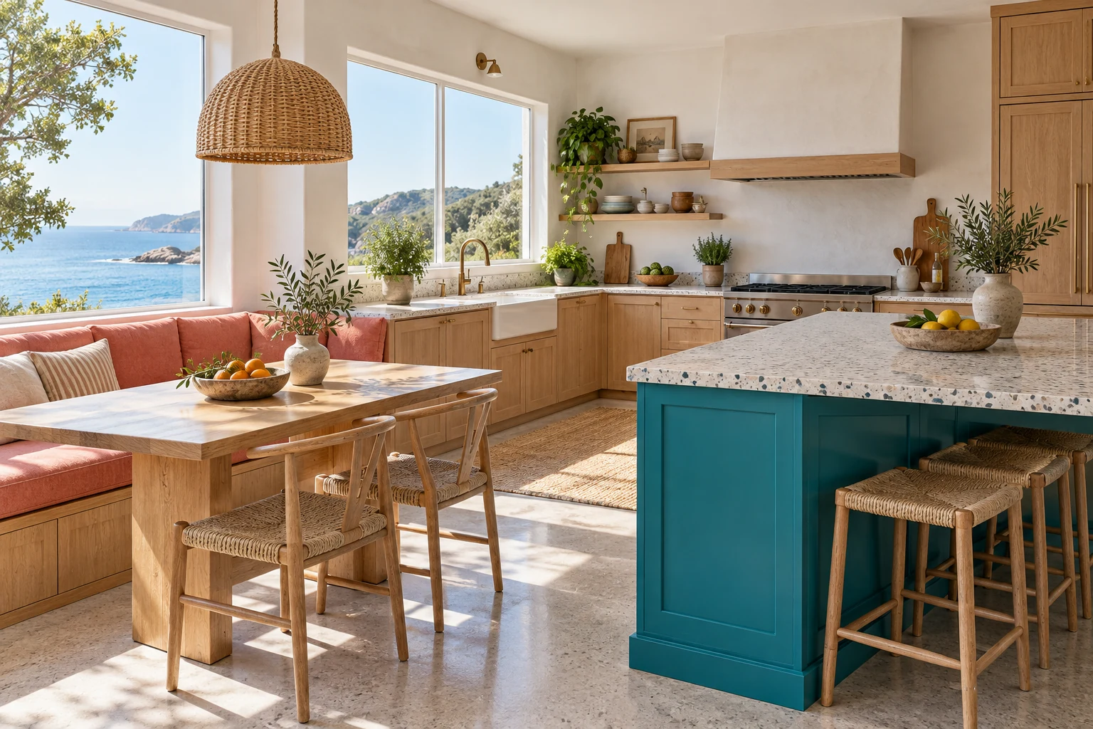
Give turquoise the island and coral the dining seat. In an L-shaped kitchen, that separation lets the colors meet across the room. Stainless steel and fine-chip terrazzo keep the work area crisp, while the coral fabric makes the breakfast corner softer.
Coral fabric can pull pink out of stone
Lay the upholstery sample beside the countertop. Pink-veined stone and orange-leaning coral can make each other look peachier than expected. For cool gray counters, compare a bluer turquoise and keep the coral on seating away from the counter edge.
Large, colorful terrazzo chips already supply a pattern, so choose plain stools alongside them. For a small first step, try coral seat pads and turquoise ceramics. These budget kitchen decor ideas with thrifted ceramics offer affordable ways to introduce the color.
3. Cherry red + powder blue: restrained retro
Powder blue
#B7D7EA
Cherry red
#C92236
Porcelain
#F7F8F4
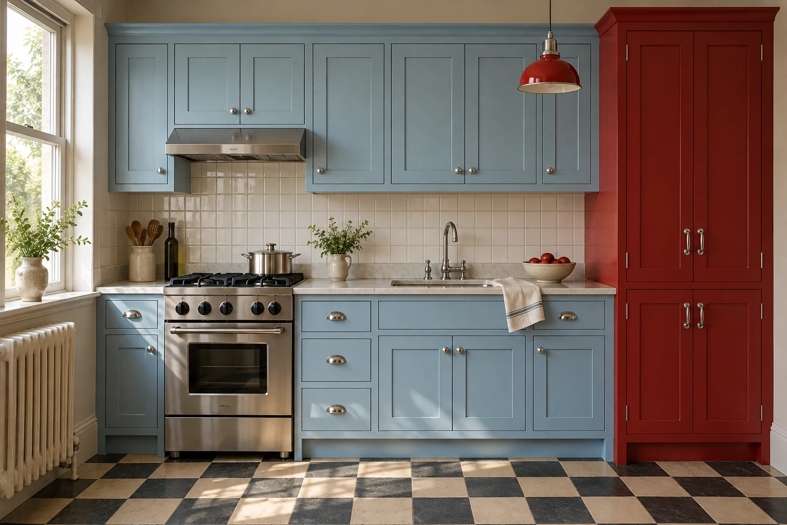
Powder blue works well on the main cabinets, and a cherry-red pantry gives your eye a stopping point at the end of a one-wall kitchen. Chrome handles and simple square tile bring in the retro detail. One substantial red piece is enough to establish the pairing.
Check the blue against the fridge and trim
Several nearly matching whites around powder blue can make it look dull. Hold the sample beside the refrigerator, window frame and worktop together. With a black countertop, keep the upper half pale to preserve a clear light area above the work surface.
A red trolley or stool is an easy place to begin. If the existing stone has a busy pattern, keep the floor simple so the red piece remains the focal point.
4. Emerald + fuchsia: collected maximalist
Emerald
#007F5F
Fuchsia
#D72685
Warm white
#F4F2EA
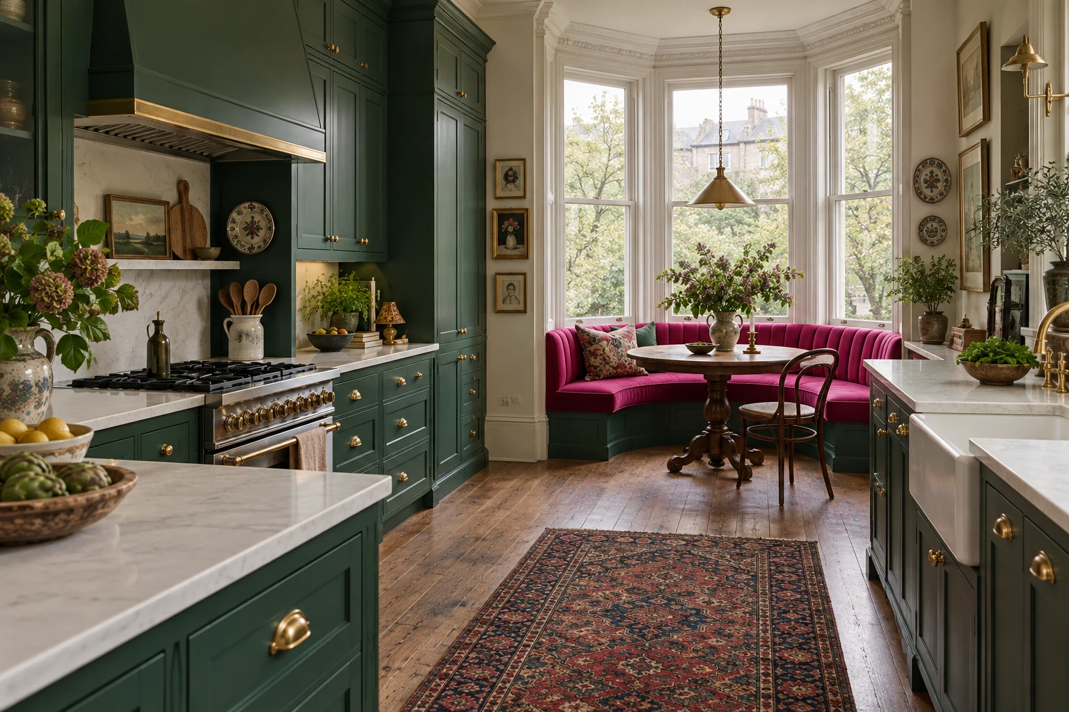
Emerald cabinets and a fuchsia banquette can share a kitchen without competing. A simple white counter gives the eye a pause between them. In a bay-window layout, the banquette gets the daylight and the cabinets form a deeper backdrop.
Velvet and patterned stone need space
Bring the upholstery sample into the kitchen and turn it in the light. Velvet changes as the pile catches the light, so check it upright and from the entrance. If the stone has dramatic veining, keep the floor and backsplash quiet.
For a compact version, put emerald on the base cabinets and fuchsia on one washable seat cover. You can judge how the two colors feel together while keeping the fabric easy to change.
5. Saffron + aubergine: art deco
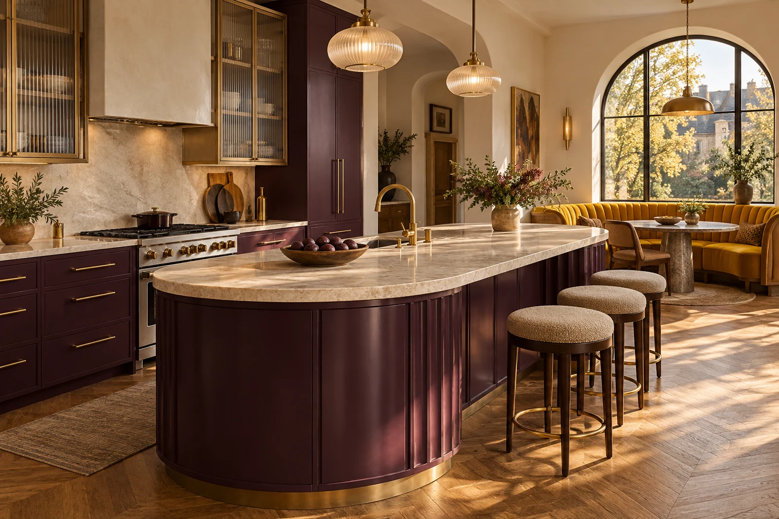
Aubergine
#542344
Saffron
#F4B400
Ivory white
#F5F0E5
The aubergine island anchors the room, and the saffron dining nook adds brightness. Curved ends, ribbed glass and a few brass details suit the Art Deco mood. Light perimeter cabinets let the island stand out as a separate piece of furniture.
Aubergine can disappear in shadow
Put the sample on the side of the island facing away from the window. If it reads almost black, move to a lighter shade or shrink the painted area. A saffron fabric sample beside the board will show whether the yellow still feels comfortable with that deeper color.
Compare the cream worktop at the same time. Pink-leaning cream can sit awkwardly beside saffron’s yellow; a small countertop chip viewed on its own is easy to misjudge.
6. Electric blue + lemon: contemporary mediterranean
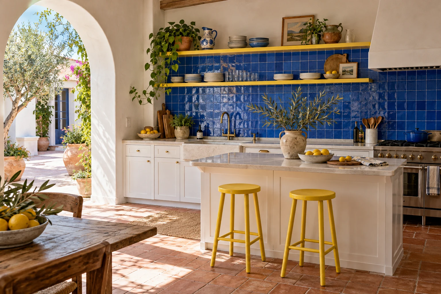
Electric blue
#2455E6
Lemon
#F7DF32
Plaster white
#FAF7EF
Electric-blue tile, a lemon shelf or stool, white plaster and terracotta floors make this scheme feel sunny. The tile takes the largest colored area. An arch can frame it beautifully, though a plain square opening works just as well.
Grout changes the blue backsplash
Ask for a tile board with the intended grout and joint width. White grout draws a graphic grid; a closer blue makes the surface read more continuously. Check reflections at the height where you normally stand at the counter.
Set the lemon sample beside any orange-brown floor that stays. If the two warm colors compete, keep yellow to one stool. Blue ceramics and lemon seating make a useful trial before ordering the tile.
7. Violet + mint: playful modern
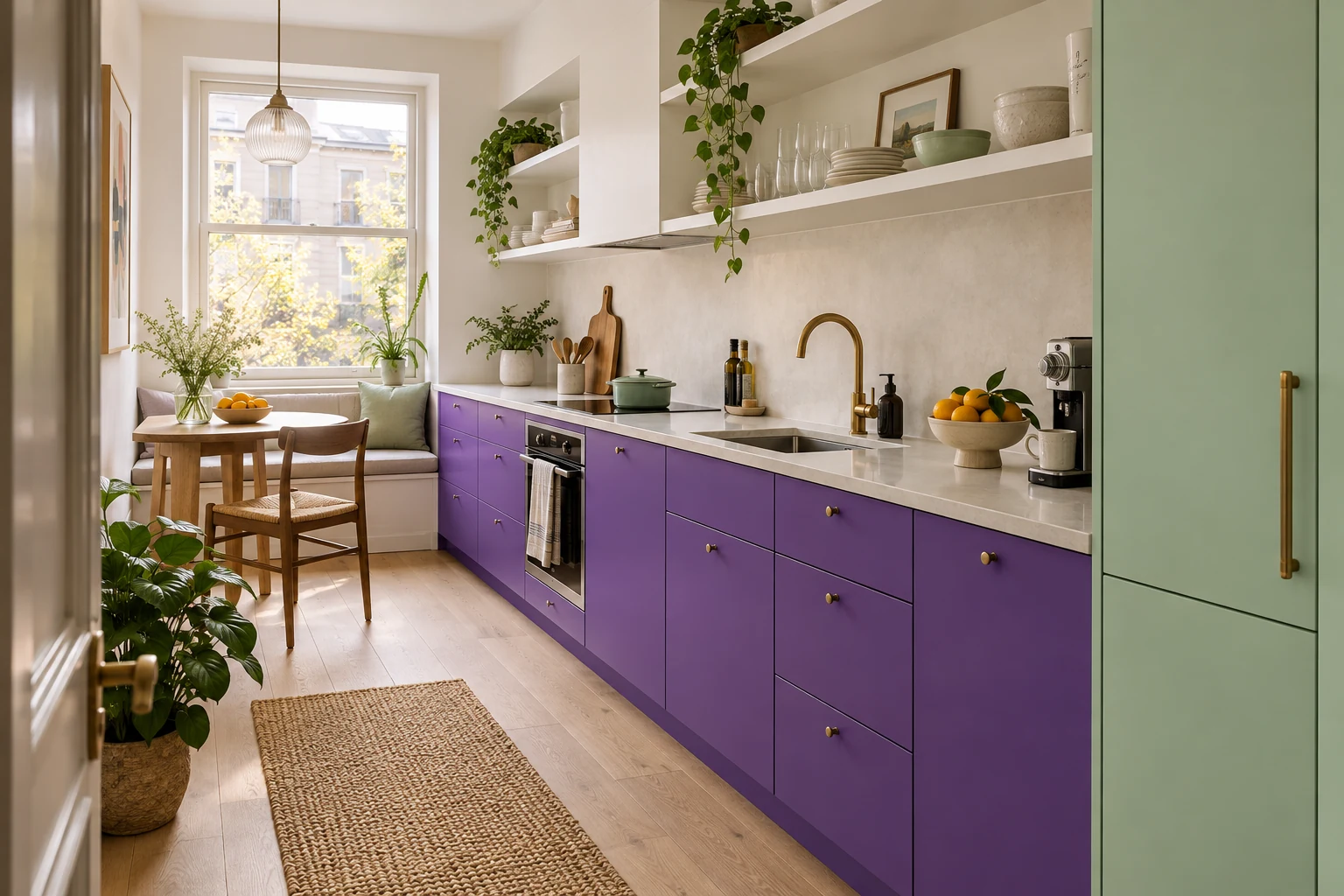
Violet
#703DB5
Mint
#B8E0CF
Paper white
#F7F7F2
Violet base cabinets bring color to a compact kitchen while leaving the upper walls light. A mint pantry door takes the second hue higher up the room. Slab doors, a plain white counter and simple hardware suit the clean lines.
Watch mint and violet under evening lights
View the two samples together at the time you cook. Mint may look yellower under your bulbs, while a deep violet may lose its purple and read nearly black. Compare a lighter violet before changing the whole lighting plan.
Pink-beige stone makes this pairing trickier: the green can draw attention to its pink cast. Try a removable mint peg rail and violet seating first if those counters are staying.
8. Terracotta orange + deep teal: warm eclectic
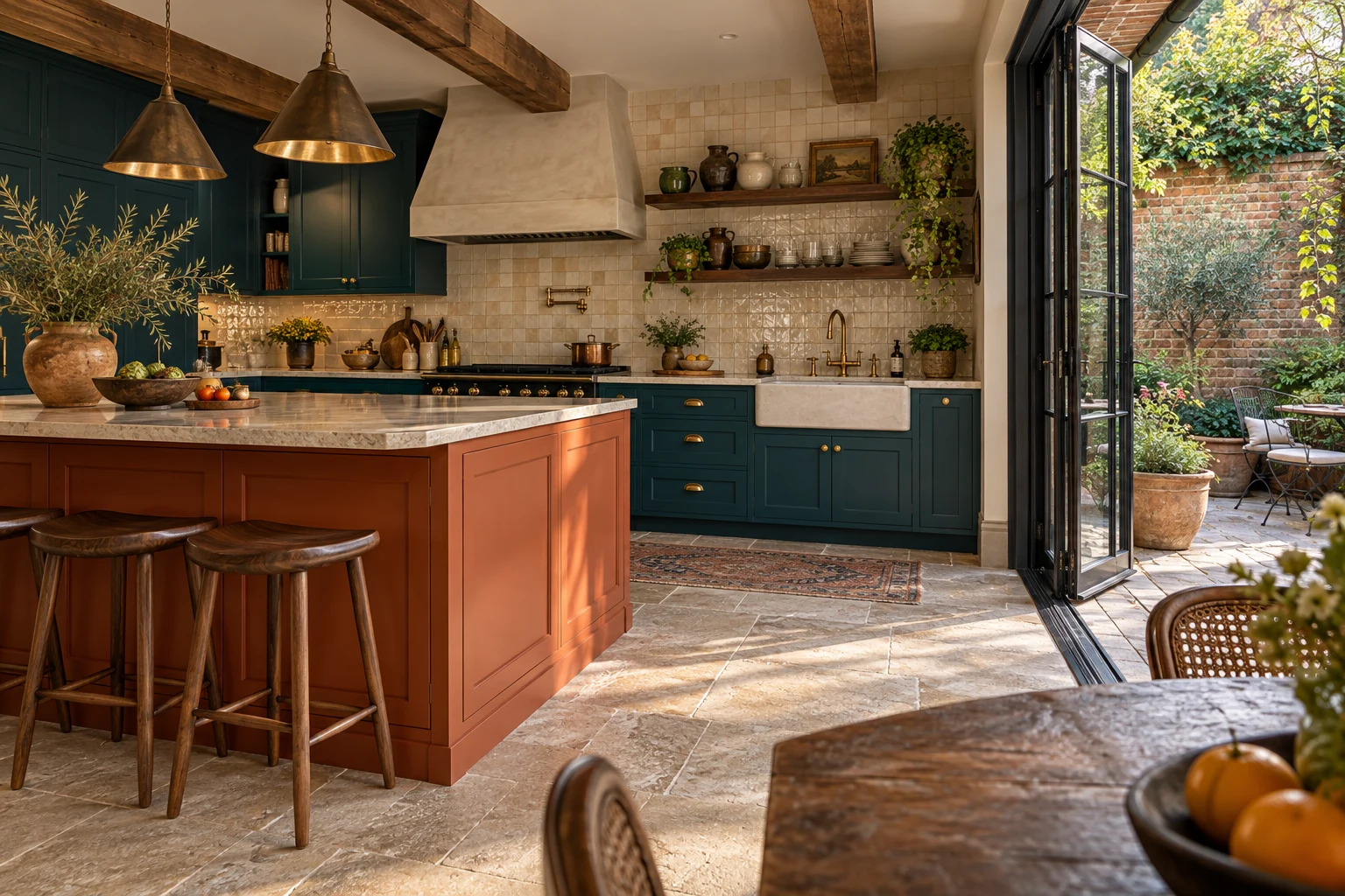
Deep teal
#075B63
Terracotta orange
#C85B35
Warm white
#F5EFE4
Deep teal sets off walnut and other warm wood. A terracotta-orange island adds another warm surface, with a plain warm-white backsplash between the cabinet runs. The result depends on how much orange is already in the floor and stone.
Count the orange tones already in the room
Put the orange board at floor level. If it almost matches the oak but the two feel wrong together, reduce the painted orange. With busy tan granite, teal cabinets and a plain backsplash may already give you the whole scheme.
In a dim room, keep the upper cabinets light and put orange on a stool or runner. That small area will show whether you enjoy adding more warmth alongside the existing floor.
9. Raspberry + burgundy: immersive townhouse
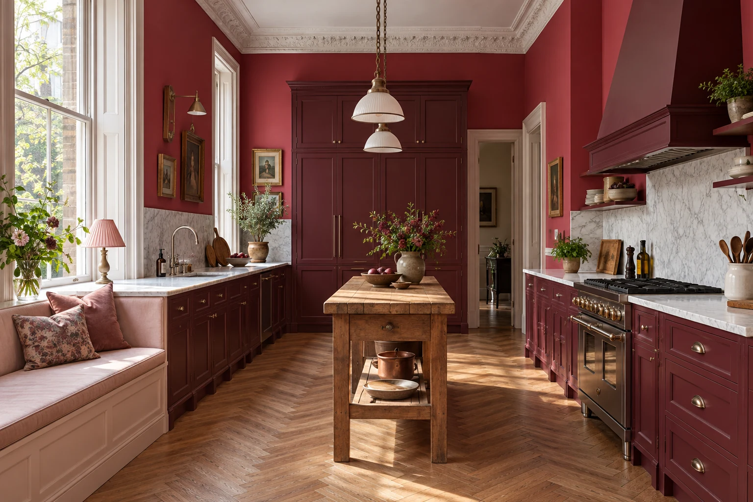
Burgundy
#75243D
Raspberry
#B82B59
Blush
#F5DCE3
Burgundy cabinetry and raspberry walls make an immersive kitchen, especially in a tall townhouse room. A blush textile adds a lighter note, and a pale worktop keeps the prep surface distinct. Start with a raspberry wall if you want to build up to the full room.
Look through the doorway before painting every wall
Several red walls can cast reflected color onto pale surfaces nearby. Check the samples from the adjoining room as well as beside the cabinets. With a low ceiling or limited daylight, leave the ceiling light and confine raspberry to one wall.
Put any pink-veined stone beside both reds. A bluer berry and a warm pink vein can be surprisingly far apart; picking the right red family matters more than the name on the paint chip.
10. Lime + ultramarine: memphis-inspired
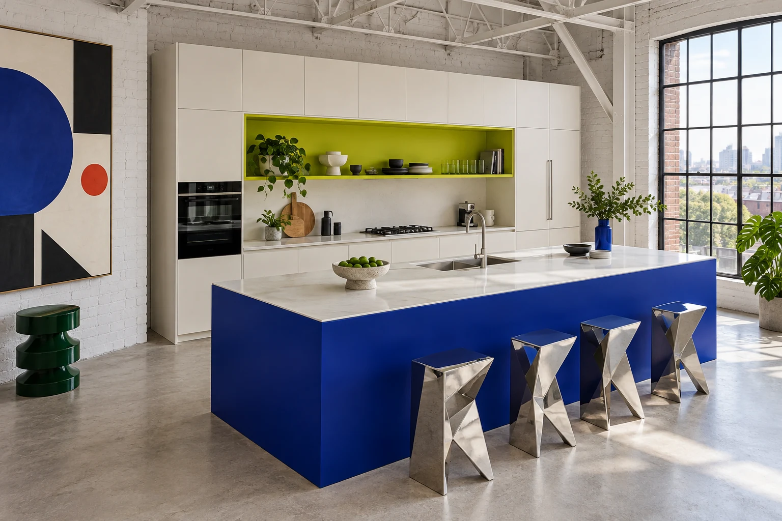
Ultramarine
#2937B8
Lime
#C4DF28
Clean white
#F7F8F5
An ultramarine island and lime recessed shelf suit a kitchen with strong geometric lines. Give the remaining cabinets and counter a plain white finish, and let one artwork or lamp carry the pattern. For ideas beyond the kitchen, explore Memphis style interior design.
Lime can become harsh beside yellow oak
Hold the lime sample next to the floor in daylight and under the evening bulbs. Both yellow wood and warm lighting can push the accent toward yellow. A small recess gives you enough color to judge the effect.
Busy brown granite leaves less room for this pairing. If it stays, try a lime tray and blue stools on the existing quiet surfaces before considering a painted island.
11. Peacock blue + copper: warm industrial
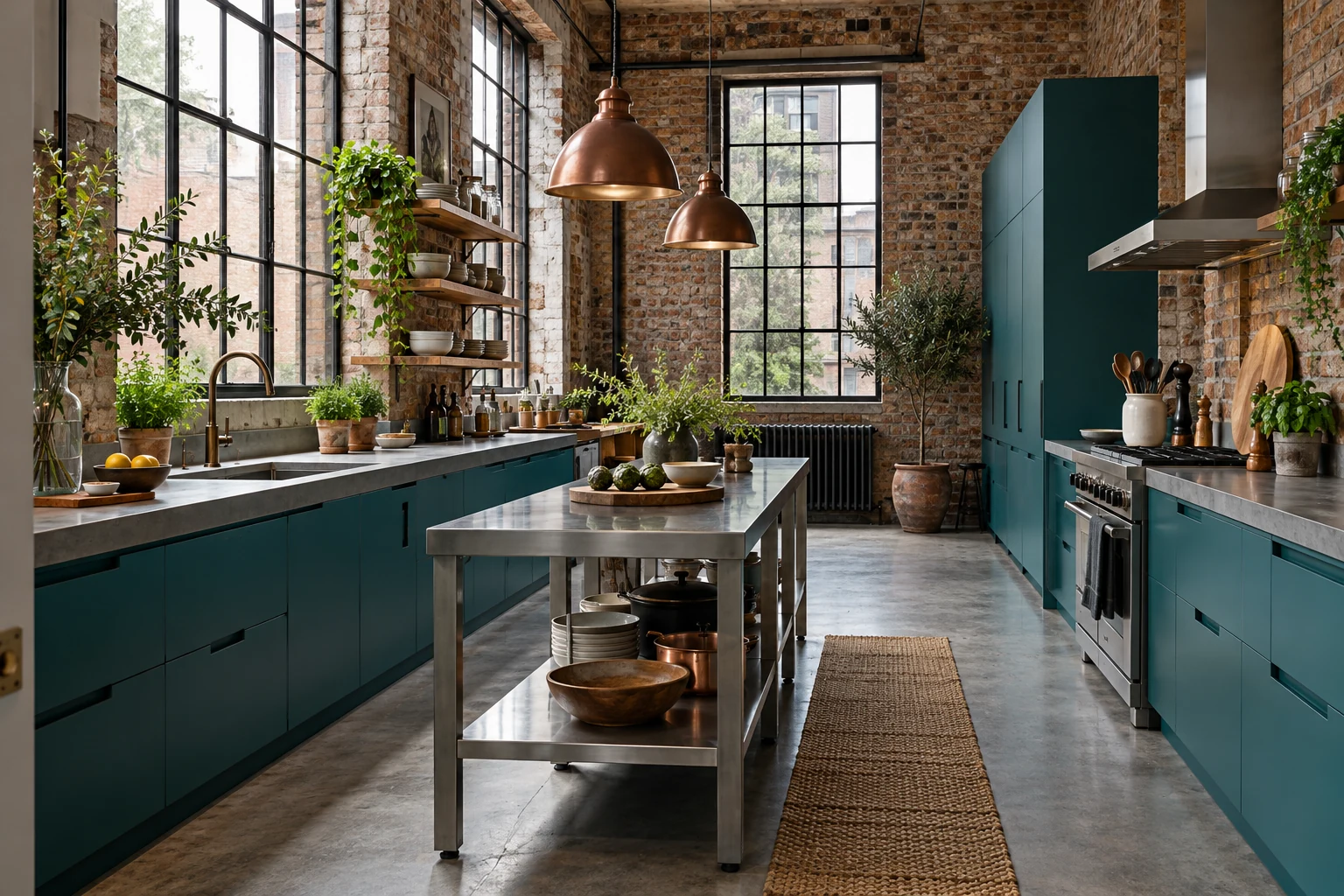
Peacock
#006D77
Copper tone
#B87333
Concrete gray
#C5C6C2
Peacock cabinets bring a deep blue-green to an industrial kitchen. Copper pendants warm the area above a quiet concrete-look counter, with brick supplying the texture. Repeat the copper in one small detail if the room needs a connection at counter height.
Choose the copper finish you want to live with
Unsealed copper changes as it develops a patina. Ask whether the finish is sealed and look at a weathered sample before choosing expensive fittings. A copper-colored accessory can help you decide how much warm metal you want.
Set the blue board beside the gray counter and brick too. A pink-gray surface changes the balance of this palette, even if it looked neutral in the showroom.
12. Mustard + petrol blue: mid-century modern
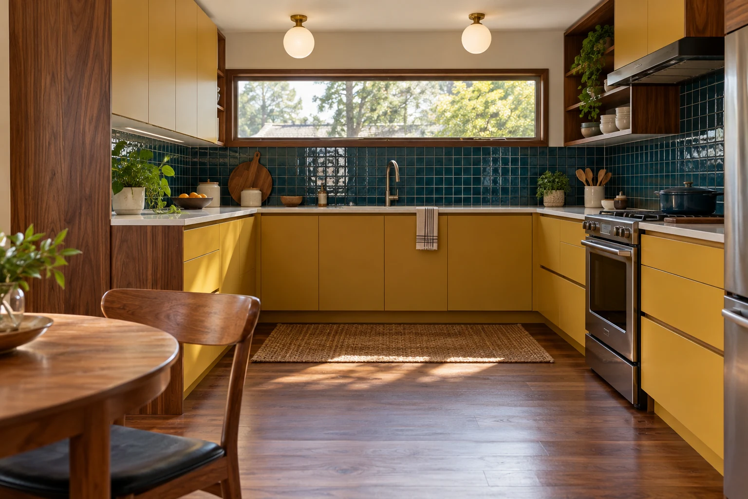
Mustard
#D5A021
Petrol blue
#164E63
Pale white
#F5F2E9
Mustard cabinets, a petrol-blue backsplash and walnut details suit a mid-century bungalow. Globe lights and slim handles carry the period character. A pale worktop keeps a bright strip between the two richer colors.
Mustard needs a clear relationship with honey wood
Compare the mustard sample with every yellow-toned wood surface that stays. A slight near-match can feel accidental. Try a clearer contrast, or reduce the mustard to the chairs.
Sound honey-oak cabinets can stay: put petrol on a wall or suitable backsplash and mustard in the seating. Lay a fabric sample beside the wood before buying the chairs.
13. Persimmon + lilac: airy contemporary
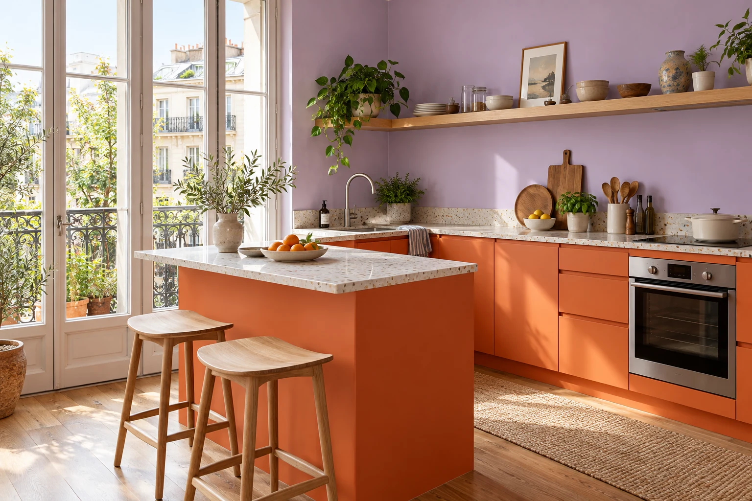
Persimmon
#E65A32
Lilac
#C5A3E0
Soft white
#F8F5F0
Persimmon lower cabinets and lilac upper walls make a bright, airy pairing. A compact peninsula gives the orange a neat endpoint. Pale terrazzo can connect the two hues when its chips are small and its background stays quiet.
Gray lilac can look muddy beside orange
Compare a clear lilac with a grayer version beside the persimmon board. The clear one may feel sweeter; the gray one may lose its freshness. Look at them with any pink-beige granite, which can become more noticeable beside lilac.
If that stone feels difficult to pair, move lilac into a print and keep persimmon as the main painted color. Lilac wall paint and orange seat cushions offer another way to try the relationship before changing cabinet doors.
14. Forest green + scarlet: traditional with an edge
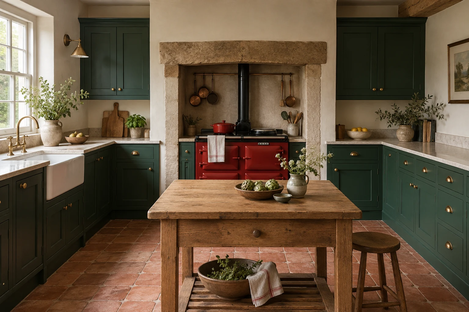
Forest green
#145A3A
Scarlet
#D52B2B
Warm white
#F6F1E7
Forest green suits framed cabinets and traditional kitchen proportions. A scarlet range alcove gives the room a concentrated flash of red, with warm-white walls around it. A red chair can do the same job in a kitchen with a backsplash you want to keep.
Equal areas of red and green can feel restless
View the pair from the adjoining room. If both colors demand the same attention, reduce the red area first. A compact alcove is easier to balance than several red surfaces scattered around the kitchen.
With burgundy flecks in the countertop, compare scarlet with a deeper red. For an alcove beside the range, check the proposed material’s heat and cleaning requirements before ordering.
15. Fuchsia + black-and-white: expressive modern
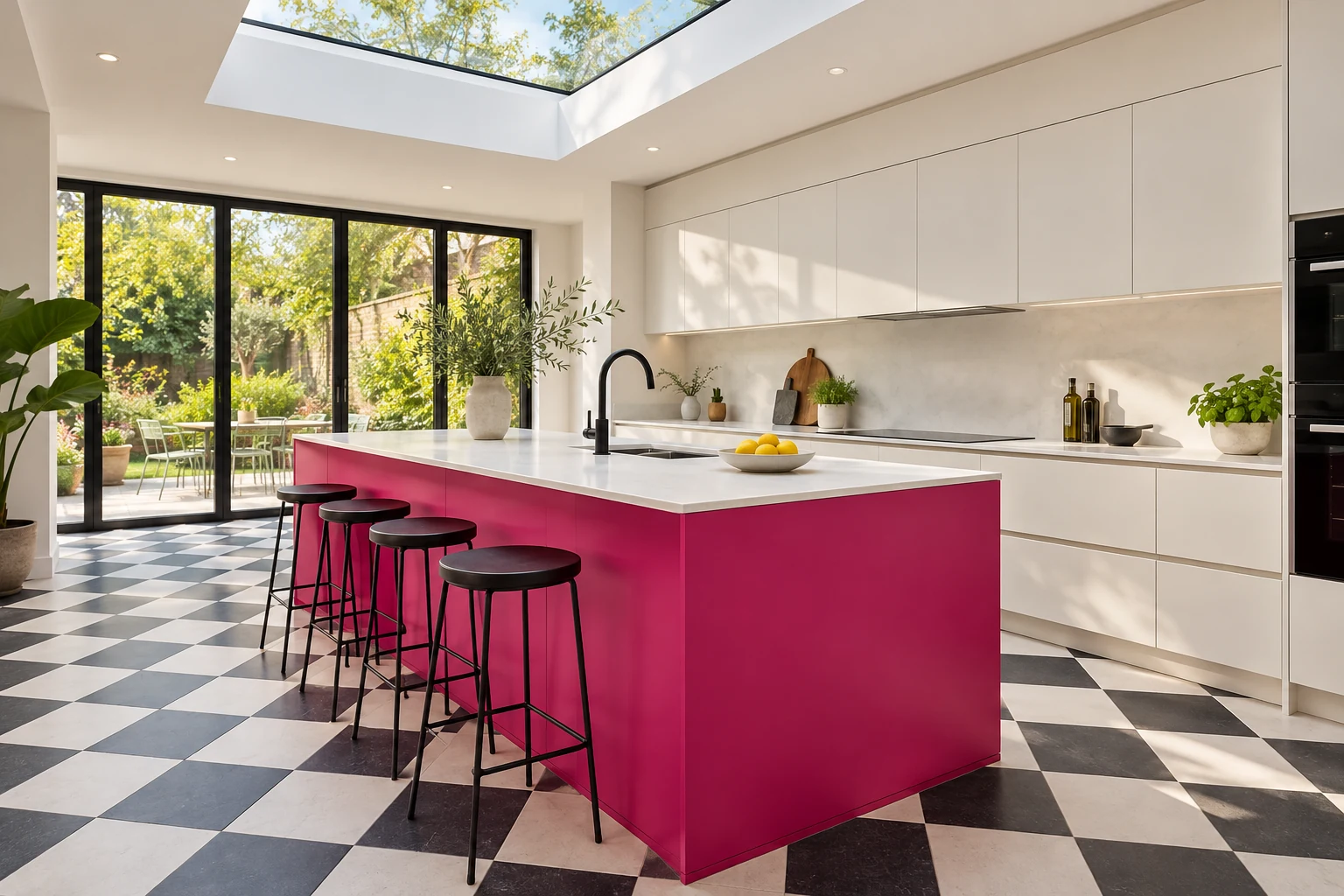
Fuchsia
#D31C79
Ink black
#202124
Bright white
#F8F8F5
A fuchsia island gives a white kitchen a strong center. Black handles or a black light fitting connect it to a checkerboard floor. Keep everything else simple, since the island and floor already do plenty of work.
Lay out enough floor tiles to see the pattern
A tiny tile chip tells you little about a checkerboard across a room. Lay out several full-size pieces with the intended joints and view them from the doorway. Notice where the island cuts across the checks.
Strong countertop veining adds another large pattern. In that case, keep the existing quiet floor and let fuchsia be the main change. A fuchsia trolley is a compact version for a smaller kitchen.
Test the palette in the kitchen you actually have
Build a sample kit you can move around
Choose two contenders from the table. Assemble the main paint color, accent fabric, backsplash and grout samples for each. Put them beside the countertop you are keeping. An offcut is handy for shopping, and a photograph helps organize the choices.
Paint boards roughly 18–24 inches across, following the maker’s coverage and drying instructions. Check the intended cabinet coating on a suitable test surface too. A sample pot helps you pick the color, but a finished door shows the sheen and texture you will live with.
Benjamin Moore recommends movable sample boards viewed through the day and evening. Stand yours upright at the sink, beside the fridge and on the darkest run. Lay countertop and floor samples horizontally.
Settle the evening lighting before approving paint
Look at the samples during breakfast, afternoon and evening preparation. In much of the Northern Hemisphere, north-facing rooms tend to receive cooler daylight. Trees, nearby buildings and window size can alter that light considerably.
At night, switch on the task and ceiling lights together. If you plan to replace bulbs, do that before making the final paint choice. A warmer bulb can change mint or violet noticeably, so return to the samples in daylight the next morning.
Compare color rendering as well as color temperature when choosing bulbs. At the counter, check whether glossy tile reflects the LED strip into your eyes. Glare can make a good-looking backsplash uncomfortable to work beside.
Handle and clean a finished door sample
Touch the sample around the handle and view it in side light. Then clean it using the maker’s instructions. Dark colors can show light dust; reflective finishes can reveal smears. Compare the actual coatings to see which finish you are happy to maintain.
Before painting existing doors, identify the surface: wood, laminate, thermofoil or another finish. Sherwin-Williams’ cabinet instructions cover preparation and a primer adhesion test. Follow the chosen system’s times for recoating, reassembly, curing and cleaning. Touch-dry does not mean ready for everyday kitchen use.
Four decisions that can lead to a second repaint
A palette has to work through an ordinary week: early breakfasts, evening cooking, splashes around the sink and the view from the next room.
You love the cabinet color, but it fights the countertop
A soft green beside a white worktop can look much sharper next to cool gray stone. Put the paint board against the countertop, backsplash and floor together. If covering the stone is the only way the group looks right, choose another paint sample or price the countertop change before you order.
The inspiration kitchen has more light than yours
Look at the windows and floors in the reference picture. A skylight and a pale floor can change the effect of deep-blue cabinets. In your kitchen, place the sample on the darkest run under evening lighting. If the blue reads almost black, try a lighter version or put it on a pantry or lower run.
The finish looks good until you use it
A door can look spotless under soft showroom lighting. Handle the sample and turn it toward a window. Fingerprints and surface texture are easier to judge in side light. Check how it cleans before paying for a whole kitchen in that finish.
You like the accent, but not across the whole room
Try the second color on a stool, removable seat cover or large board. View it from the entrance and adjoining living space. If it competes with the main color, reduce its area. One red pantry or a pair of orange stools may give you exactly the amount you wanted.
Small details to put on the color plan
- Island ends and cabinet returns. The stool side and the panel beside a doorway can be more visible than the doors. Include them when deciding how much color the room gets.
- The edge of the painted area. Mark the pantry frame, wall corners and cabinet returns before work begins. It saves an awkward decision halfway through painting.
- A bright cupboard interior. A breakfast cupboard or pantry can hold a vivid color you see when you open the doors.
- Grout and joint width. Include both on the tile sample. A contrasting grid may become the room’s strongest pattern.
- A small first purchase. Start an uncertain accent with upholstery, a stool or a vase you would enjoy elsewhere too. These ideas for styling colorful ceramic vases give you a few ways to try it.
Questions to settle before spending
Can a small kitchen be dark and colorful?
Yes. Deep color can make a small kitchen feel enveloping, with good lighting at the work surfaces. For an airier effect, keep the counter and upper zone lighter. Decide which atmosphere you want, then check how much cabinetry fills the view.
Do the island and perimeter need the same paint color?
A different island color can define the room. Check all its sides alongside the seating and adjacent living space. A pantry or freestanding piece can take the same role in a kitchen without an island.
Should I paint good wood cabinets to get this look?
Try colored walls, stools or backsplash samples with the wood first. If you still prefer painted cabinets, weigh the preparation and cost against the finish you already have. Palette 12, for example, works with retained honey oak and smaller mustard accents.
Will a bold kitchen hurt resale?
The sources above do not establish a resale premium or penalty for these palettes. If a sale is close, ask a local agent about buyers in your area before committing to an expensive fixed finish.
Can I order paint from the HEX code?
Use the code to shortlist physical samples with a supplier. Once you have approved one in your kitchen, record the manufacturer, product, color name and sheen on the order.
Write down the final choices
Complete this sentence before ordering: “We are keeping ___; the main color goes on ___; the accent goes on ___; the quiet surface is ___; we approved the samples in ___ daylight and under ___ evening lighting.” Fill each blank while the material samples are still together.
Sources
Checked October 16, 2026.
- Houzz: 10 Kitchen Remodeling Trends to Know for 2026, January 13, 2026 — U.S. homeowner study.
- NKBA: 2026 Kitchen Trends Report public release, September 18, 2025 — professional forecast.
- NKBA: 2027 Kitchen Trends Report public overview, October 14, 2026.
- Benjamin Moore: North-Facing Room Paint Colors — light and sample boards.
- Benjamin Moore: Lighting and Paint Colors — daylight and artificial light.
- Sherwin-Williams: Update Kitchen Cabinets in 5 Steps — preparation and adhesion testing.