Colorful & Artistic Candle Holders: 9 Styles for Living Rooms
THE ART OF THE LITTLE OBJECT
A red ceramic squiggle. A cobalt glass orb. A hand-carved candlestick with an uneven glaze. These are the candle holders that can make a whole living room feel more personal.
Some candle holders deserve the attention we give to artwork. Think of a glossy tomato-red candlestick against dark walnut, a turquoise handmade piece on a flea-market cabinet, or an offbeat checkerboard form beside a mustard-yellow lamp. Each one changes the mood of the room even before you light a candle.
If you love colorful, unusual home accessories, this guide is about artistic candle holders for living rooms: which shapes belong with which decorating styles, how to mix strong colors, and how to display sculptural pieces without making the room look like a shop window. We explore studio pottery, hand-painted folk art, mid-century modern, Memphis, Pop Art, kitsch, avant-garde, boho and beautifully worn vintage finishes.
Affiliate disclosure: As an Amazon Associate, GlowNestBlog earns from qualifying purchases. This article contains an Amazon link, and we may receive a commission if you buy through it, at no extra cost to you.
First, identify the shape your room is missing
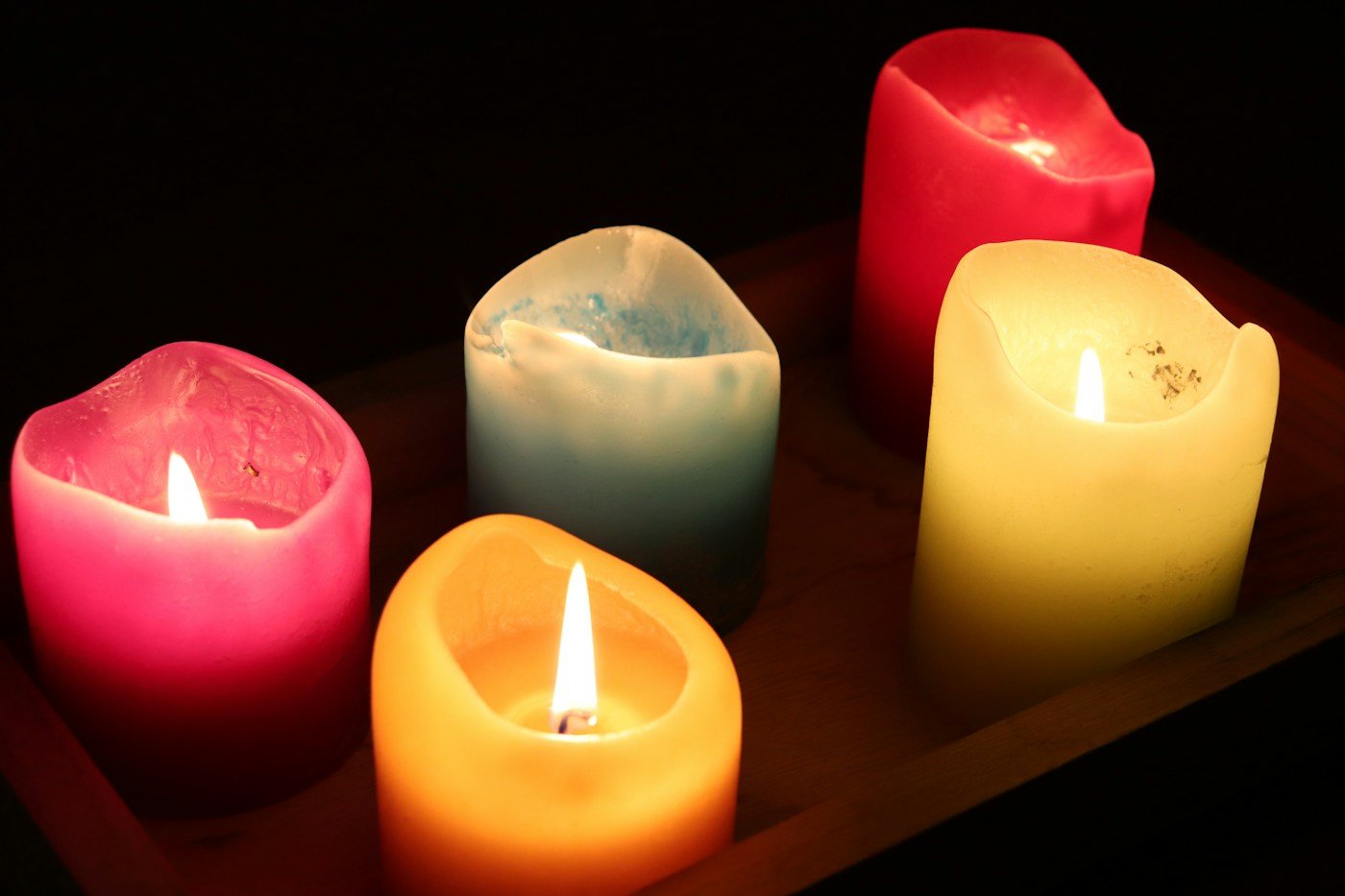
You do not need a matching set. Look at your coffee table or console and decide what would make a useful contrast. A room full of rectangular furniture often benefits from a curvy holder. A patterned room may need one solid-color sculpture. For an already colorful room, a single piece with a large, recognizable outline usually makes more sense than six tiny accessories.
The quick style-to-shape guide
Studio pottery: uneven glaze + expressive form
Folk / artisan: specific hand-painted motifs + earthy color
Mid-century: teardrops, cones, slim stems + walnut
Memphis: spheres, stripes, zigzags + high-contrast blocks
Pop Art: glossy icon shapes + one loud accent color
Kitsch: nostalgic figurines + cheerful color
Avant-garde: asymmetry, loops, brutalist texture
Boho: collected ceramics + mixed but related colors
Distressed vintage: patina, oxidized metal + worn wood
These are visual directions, not strict design categories. A hand-built ceramic piece could suit a mid-century room; a kitschy flower-shaped holder might be exactly what a minimalist living room needs.
1. Studio pottery: expressive glazes and irregular silhouettes
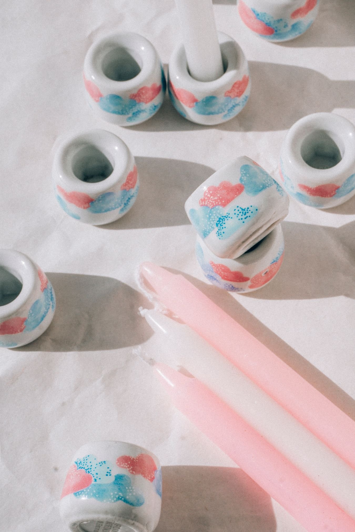
Studio pottery is where candle holders become miniature sculptures. Look for a pinched lip, a thick foot, intentionally visible hand-building marks, carved lines or a glaze that pools darker in the grooves. The best pieces have a silhouette worth looking at from several angles. Some are rough and quiet; others use coral red, inky blue or crackled mint glaze.
Best room: a lived-in contemporary living room with vintage wood, art books, wool, a boldly painted wall or an interesting rug. Placement: stand one substantial holder slightly off-center on a sideboard, next to a low dish. Give it a little space so the uneven rim and glaze remain visible.
Before shopping, check the base from below and the candle opening from above. Handmade does not automatically mean level or candle-safe. Ceramic Arts Network has documented carved, wheel-thrown candlesticks, a useful reference for understanding how relief carving and glaze can create distinctive surfaces.
Product inspiration · Amazon
Compare the candle holder in this Amazon listing with the studio-ceramic and sculptural ideas in this section. Look closely at its current product photos, material, scale and candle-fitting instructions before deciding where to display it. The short link did not provide independently verifiable specifications, so the listing is presented as a shopping example rather than a tested recommendation.
2. Folk-art and regionally inspired ceramics: choose a real craft tradition
“Ethnic” is too broad to describe a design meaningfully. Look instead at a specific tradition or maker: hand-painted Talavera-style floral patterns, Portuguese-inspired blue-and-white motifs, North African geometric ceramics, or folk-painted pottery from an identified region. The colors and techniques matter, but so does knowing who made the piece and where its patterns come from. If a seller calls a new factory-made object “authentic artisan pottery,” look for evidence rather than accepting the description.
Best room: one with woven textiles, books, antique wood or an eclectic rug. A turquoise-and-rust holder may pick up details from a patterned cushion. Placement: let a single painted object sit with quieter neighbors. A wall of matching patterned accessories can overwhelm the subtlety of the handiwork.
For a contemporary setting, repeat one color from the holder in a picture frame, upholstery piping or vase. The room should echo the ceramic without turning into a theme display. Avoid treating unrelated cultural motifs as interchangeable decoration.
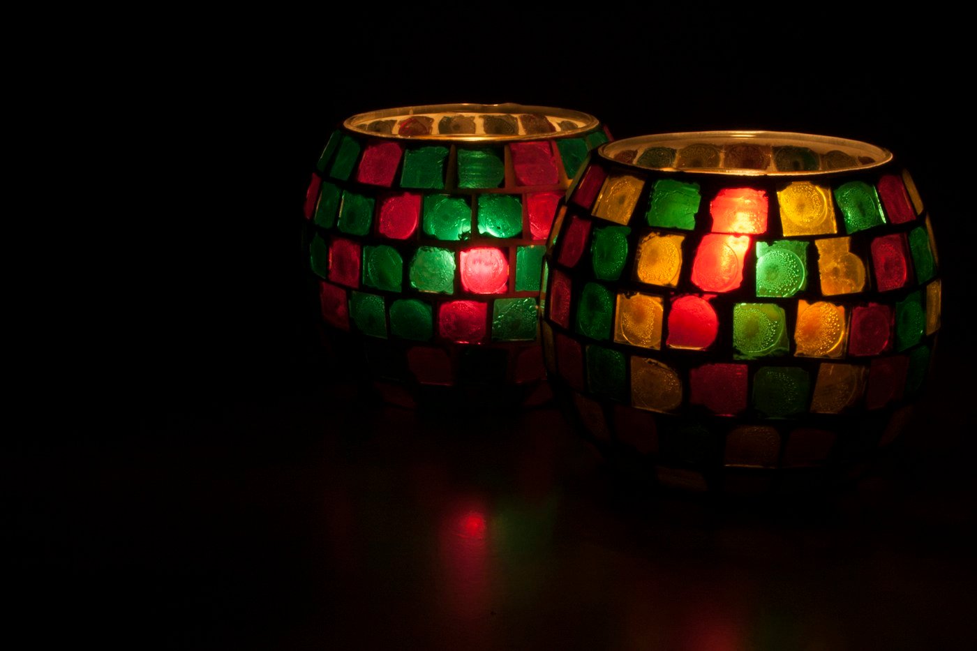
3. Mid-century modern: playful proportions, walnut and saturated color
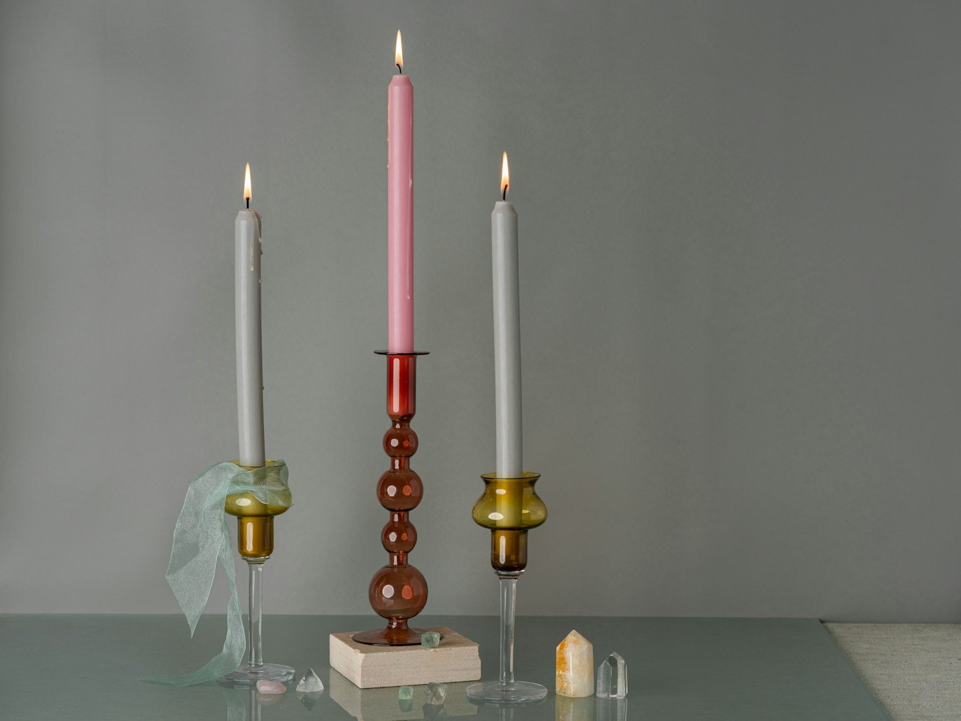
Mid-century candle holders work best when they connect to furniture proportions: slim taper stems, shallow dishes, rounded tops and tapered feet. Try an orange-glazed cone or a sculptural pair in mustard yellow and olive green against teak or walnut. Vintage brass and hammered metal add contrast if the room already has colorful upholstery.
Best room: one with a low sofa, timber credenza, globe lamp or angular armchairs. Placement: put one taller holder and one shorter object at opposite ends of a credenza, leaving plenty of timber visible. Their heights can differ, but avoid blocking a low-hung print.
Don’t confuse mid-century with Memphis: mid-century usually relies on disciplined proportions and furniture-friendly silhouettes. Memphis exaggerates those silhouettes and happily mixes shapes that appear to clash.
4. Memphis design: zigzags, stacked spheres and deliberate color clashes
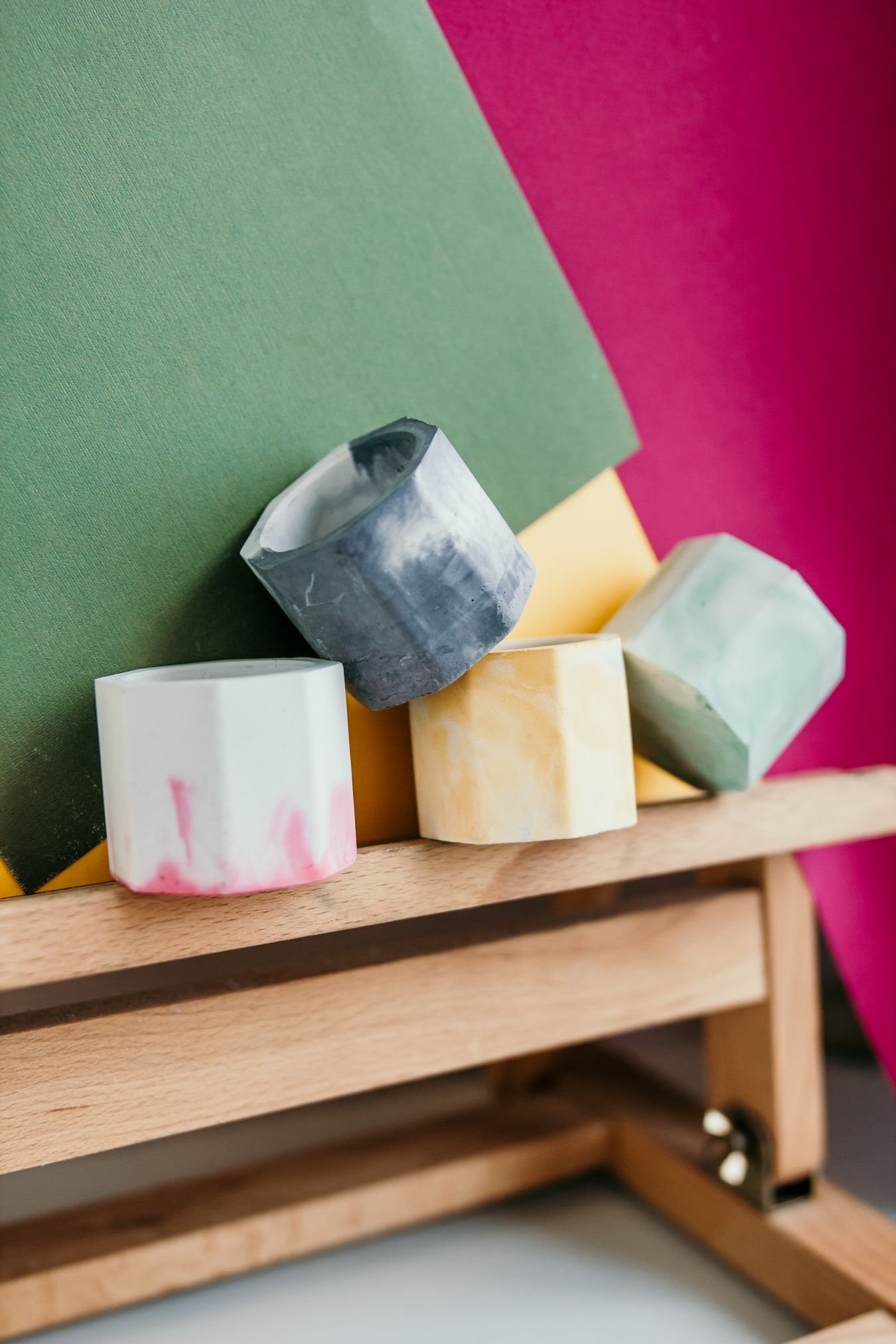
Here, the candle holder can look almost like a little architectural toy. Think stacked spheres, striped cylinders, arched cutouts, a triangular base under a circular candle cup, or a wiggly stem painted electric blue. The Memphis movement is associated with the bold geometry, unexpected materials and color of early-1980s Italian postmodern design. Lumens’ history of Memphis style explains the connection to Pop Art, kitsch and geometric forms.
Best room: a contemporary space that can take a deliberate visual jolt, whether it is mostly white or already colorful. Placement: a glossy cobalt shelf, cream console or lacquered side table gives a sharply shaped holder somewhere to stand out. Choose two colors from the piece and repeat them once elsewhere, perhaps in an artwork and a cushion.
Common mistake: too many small zigzags. A checkerboard rug, striped vase, geometric lamp and spotted holder can compete. Let the candlestick carry the pattern and simplify one nearby accessory. For more colorful-room inspiration, visit our Memphis interior design ideas.
5. Pop Art: bold, glossy objects with an unmistakable outline
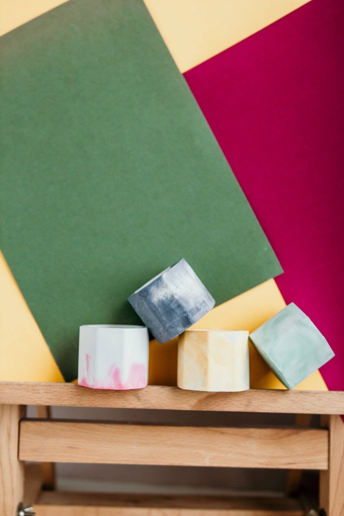
Pop Art candle holders make familiar shapes fun again. A glossy red lip-shaped holder, a yellow flower base, or an oversized pastel knot has the graphic clarity of a poster. The shape should read instantly from across the room. Unlike Memphis, which mixes geometry into unusual arrangements, Pop Art often borrows recognizable imagery and bright commercial color.
Best room: a lively contemporary living room with comic art, colorful prints or modern furniture. Placement: put one icon-shaped piece on a low table with a flat, uninterrupted background. A white or black table can make cherry red sing; a pink shelf can look exciting under a tomato-red flower.
What to avoid: turning every surface into a novelty collection. One funny object often feels intentional. Eight competing figures look accidental. Check the candle socket carefully on decorative shapes; choose a flame-free version if the product is purely sculptural.
6. Kitsch and nostalgia: imperfect, cheerful and a little theatrical
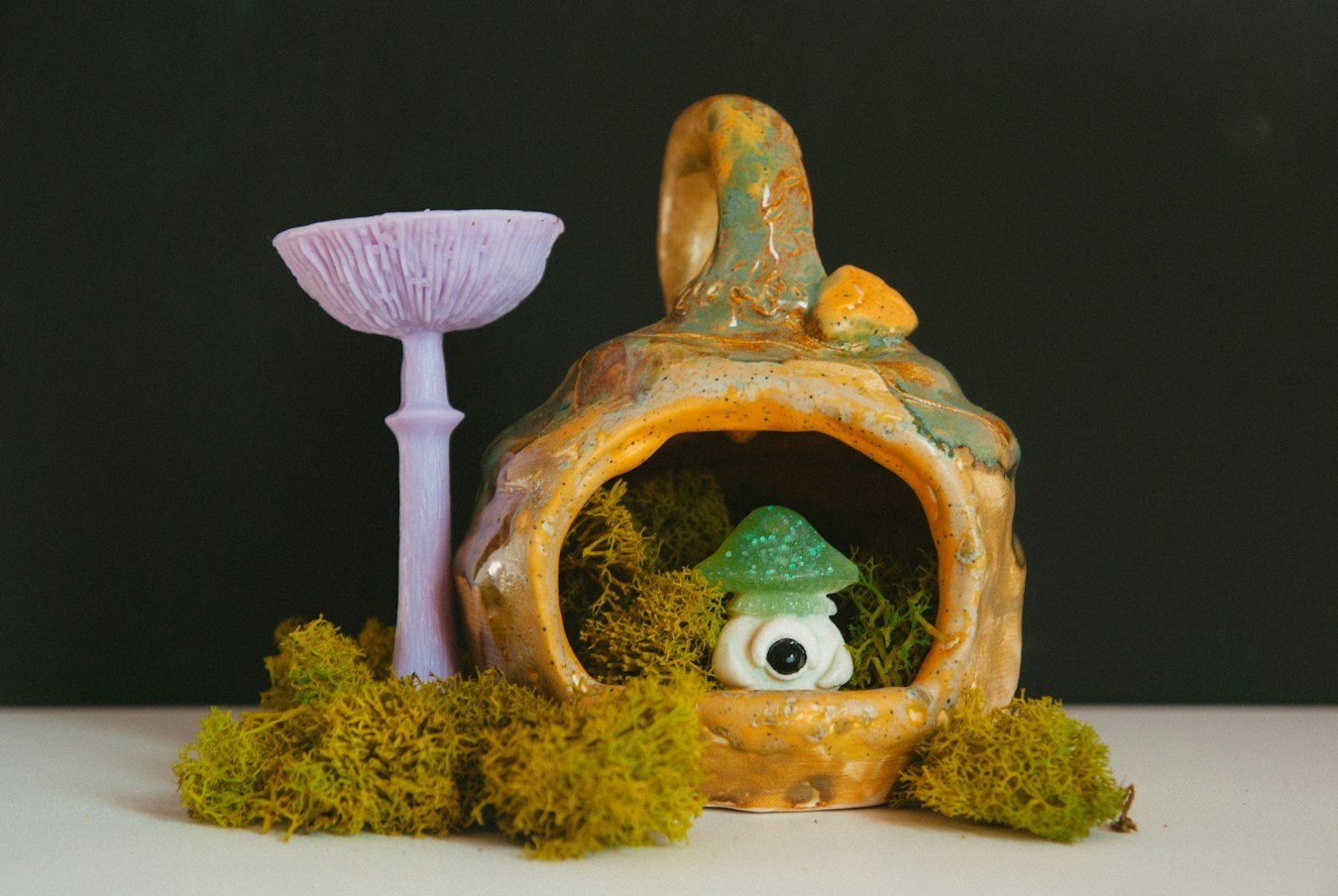
Kitsch is not a flaw when used with intention. A painted mushroom, a little cherub, a flamboyant swan or a retro diner-style shape can be a perfect counterpoint to an expensive-looking sofa. A kitschy holder gives a room humor and a sense of ownership. Choose an object that genuinely makes you smile, rather than collecting novelty for its own sake.
Best room: vintage eclectic, 1970s revival, grandmillennial or playful apartment decor. Placement: pair one kitsch object with something more sober, such as a simple book stack or a modern table lamp. That contrast lets the humor land.
Practical note: old figurines and novelty ceramics may never have been engineered as candle holders. Unless the item is explicitly rated for candle use, treat it as a display piece or use an appropriately fitted flameless candle.
7. Avant-garde and sculptural brutalism: asymmetry with purpose
Consider an uneven ceramic loop, a cast-metal branch, a jagged crossbar or a candelabrum that looks almost impossible to balance. Those are the forms that turn a mantel into a mini sculpture gallery. Brutalist-influenced pieces often emphasize rough, worked metal and a visible sense of construction; other avant-garde designs use smooth biomorphic curves instead.
Best room: an art-forward contemporary or industrial interior, especially one with concrete, textured plaster, aged leather or bold artwork. Placement: set one strong piece against a relatively plain wall. Treat its silhouette as the focal point and give it more room than a small vase.
The important compromise is function. A dramatic asymmetrical sculpture still needs a stable base, a secure candle socket and safe clearance if it is meant to be lit. If those properties are not clear, use it unlit.
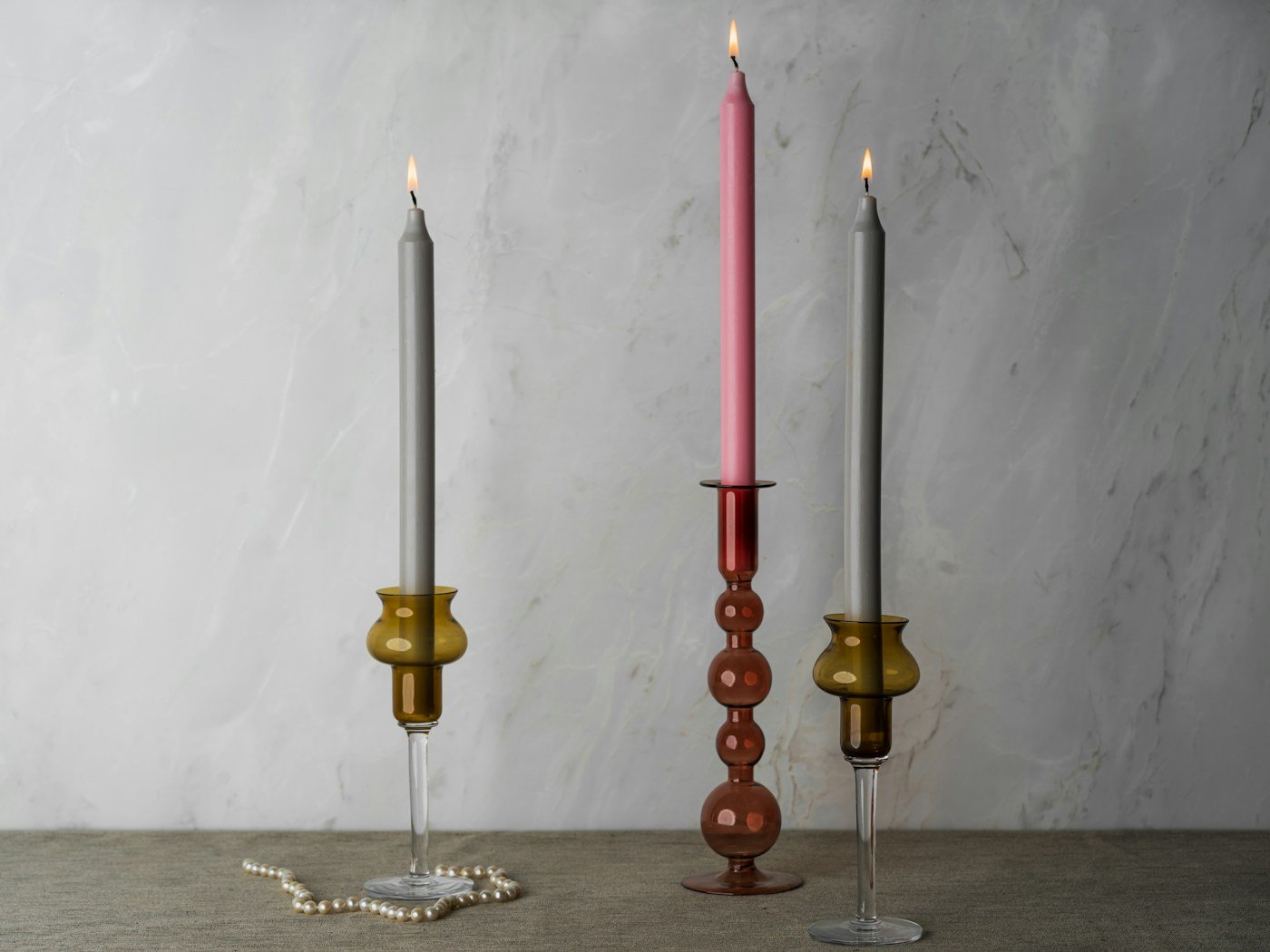
8. Boho and collected interiors: contrast rich surfaces, repeat a color
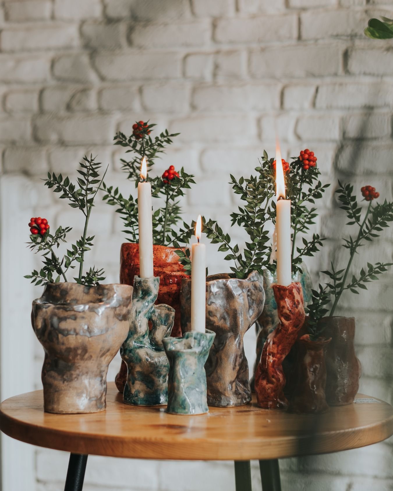
In bohemian rooms, interesting objects do not need to match. A teal stoneware candlestick can sit beside painted pottery and a small brass dish, especially if the sofa or rug contains the same warm and cool notes. The trick is to make the group feel collected over time instead of assembled from one catalogue.
Best room: layered textiles, wood, indoor plants, inherited pieces and a deep-colored rug. Placement: put two different-height holders together on a sturdy sideboard. Leave open space around the group, then move the plant or artwork nearby until the overall outline feels balanced.
A practical color trick is to pick one accent from the rug and one from the holder, then use those two shades for the rest of the small objects. You can see similar layering ideas in our boho living room inspiration.
9. Distressed and vintage: patina, rust and visible history

A chipped-looking glaze or oxidized bronze finish can be beautiful when the room has polished wood or new upholstery. Look for genuine patina, weathered cast metal, speckled stoneware or deliberately distressed painted finishes. Distressed decor can bring depth to a room that otherwise feels too new.
Best room: vintage eclectic, rustic-modern or soft industrial. Placement: an aged metal holder beside a clean-lined sofa gives a welcome material contrast; two weathered objects and a single modern lamp make a more convincing vignette than an entire surface of deliberately “antiqued” accessories.
Check before lighting: cosmetic distress is fine, but loose parts, corrosion through metal, unstable feet and cracked ceramic may make a holder unsuitable for a flame. Those are functional defects, not decorative charm.
How to combine two styles without a decorating headache
Memphis + mid-century: connect a bright geometric holder to walnut furniture with one repeated color in artwork. Keep the furniture shapes calm so the holder remains the playful element.
Studio pottery + boho: mix carved terracotta and glazed cobalt, but give the group one connecting tone: rust, olive or cream. A patterned rug can do the connecting.
Kitsch + modern: use one comic flower, fruit or figurine shape against a simple shelf, rather than mixing several novelty objects into one small space.
Brutalist + vintage: pair blackened metal with warm brass or walnut. The difference in surfaces looks deliberate when the silhouette of one piece is visually simpler than the other.
Where to display colorful candle holders
On a coffee table: low and bold beats tall and busy
A squat red glazed form or a wide colorful glass holder can become the table’s focal point without interrupting conversation. Place it toward one side and leave room for a book, remote or drink. If a holder is tall enough to be knocked during everyday use, move it to a console. For frequently used coffee tables, flameless candles are often the easier choice.
On a sideboard: height makes the composition
Start with one taller sculptural holder, then a low bowl or a short vase. Watch the outline from the sofa, not just from directly above. Repeat a small color from a framed print above the sideboard and resist the temptation to fill every gap.
On a fireplace mantel: check the appliance first
A mantel can show off a distinctive object when the fire is off. If the fireplace operates, read the manufacturer’s clearance and placement instructions before displaying a holder there; a stylish photograph does not establish that an open flame is safe. Our living room fireplace ideas cover layout options that make use of the mantel without overcrowding it.
Buying checks for sculptural ceramic and metal holders
Ask four practical questions: What candle is the holder designed for? A taper socket is not interchangeable with a pillar platform. Is the base broad and level enough? An uneven foot may be fine for a shelf sculpture but not a burning candle. Does the surface tolerate heat and wax? Painted resin or cold-painted decor may be ornamental only. Can you actually clean the shape? Deep crevices and textured glazes can trap wax.
Read the maker’s instructions instead of inferring safety from the material. Kiln-fired ceramic is not by itself proof that every sculptural candleholder is approved for flames. For handmade work, ask the artist about its intended use. Azure Magazine’s September 2026 look at modular holders is an example of how unusual compositions can stay functional when the pieces are engineered as a system.
Important candle-safety note
According to the U.S. Fire Administration and the National Fire Protection Association, lit candles belong in stable holders at least 12 inches (30 cm) from anything that can burn. Never leave them unattended or use them close to dried plants, books, curtains or other combustible decor. A colorful candle holder looks just as good by day, and an LED candle often gives the same styling effect in a tricky spot.
Questions readers ask
Do colorful candle holders work in a mostly neutral living room?
Yes. Try one high-contrast object, such as cobalt glass against cream or bright red ceramic against walnut. It gives the eye a place to land without changing the room’s furniture.
How many statement candle holders is too many?
There is no fixed number. On a small coffee table, one is usually enough. On a long sideboard, a pair can work if their silhouettes are different but their colors relate. If each holder competes with artwork and lamps, edit the grouping.
Should all the finishes match?
No. Glossy glaze beside rough stoneware can look very good. Repeat one color or shape to make the collection feel intentional.
Are sculptural candle holders always safe for actual candles?
No. Decorative sculptures, especially those made from resin, painted wood or mixed materials, may not be approved for burning. Check the maker’s instructions and use flameless candles when there is any doubt.
The strongest choice is the one that looks interesting from across the room, repeats something you already love in the space, and still leaves the table useful. Start with a shape you would keep even if you never lit the candle.
Editorial basis, updated October 2026: This is a style-matching and shopping guide, not a hands-on product test. Research references include Lumens (Memphis design), Ceramic Arts Network (making studio candlesticks), Azure Magazine (sculptural modular holders), and U.S. federal and NFPA fire-safety guidance linked above. The Amazon product’s current specifications, availability and construction have not been independently verified. Photographs on this page are licensed Pexels and Unsplash selections, credited at each image; none was copied from the site’s earlier candle-holder post. Some images show material or color references rather than specific product recommendations.