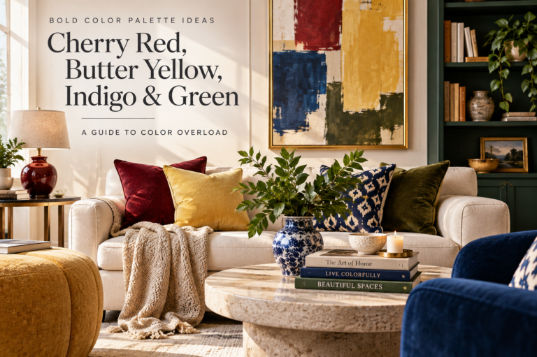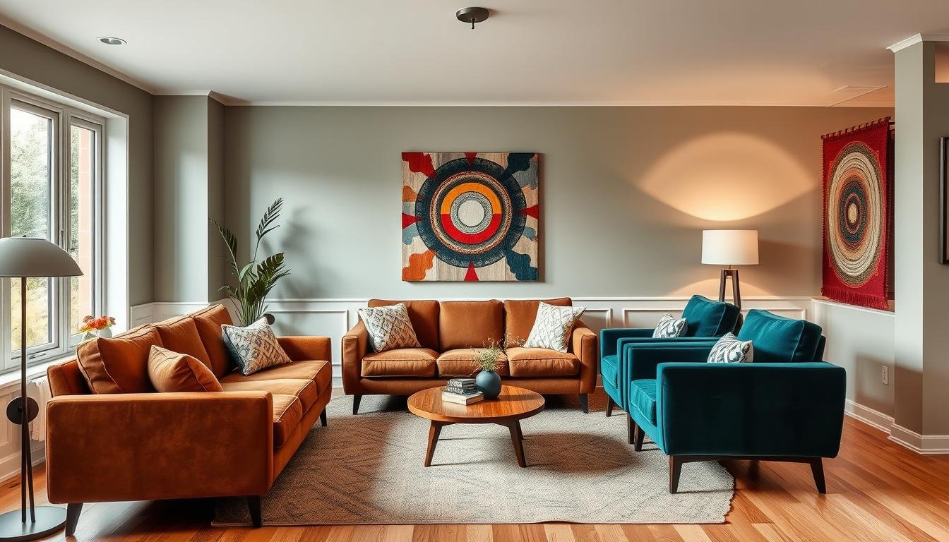
Top Living Room Colors 2026: 10 Designer-Inspired Shades to Try
The top living room colors for 2026 are noticeably warmer, earthier and more expressive than the cool-gray palettes that dominated interiors for years. Paint brands are leaning into grounded neutrals, smoky greens, wine reds, creamy ivories and deep brown-based shades that make a living room feel collected rather than overly styled.
The 2026 direction gives you several useful options: keep the walls quiet with khaki or ivory, create drama with mahogany or espresso, or bring in nature-inspired color through jade and mossy green.
Living Room Color Trends for 2026 at a Glance
The strongest themes across major 2026 paint forecasts are warmth, nature, individuality and longevity. Instead of chasing one dramatic trend, many brands are presenting colors that can live comfortably with wood, stone, linen, brass and other materials people already have at home.
| 2026 Color Direction | Best Living Room Effect | Pairs Well With |
|---|---|---|
| Warm mahogany and wine reds | Moody, elegant, intimate | Cream, walnut, brass, linen |
| Smoky jade and moss green | Natural, sophisticated, calming | Oak, black, stone, warm white |
| Khaki and creamy ivory | Quiet, flexible, timeless | Almost any accent color |
| Espresso and charcoal brown | Architectural, luxurious, grounded | Camel, ivory, antique brass |
| Soft yellow and clay | Warm, optimistic, sunlit | Olive, natural wood, cream |
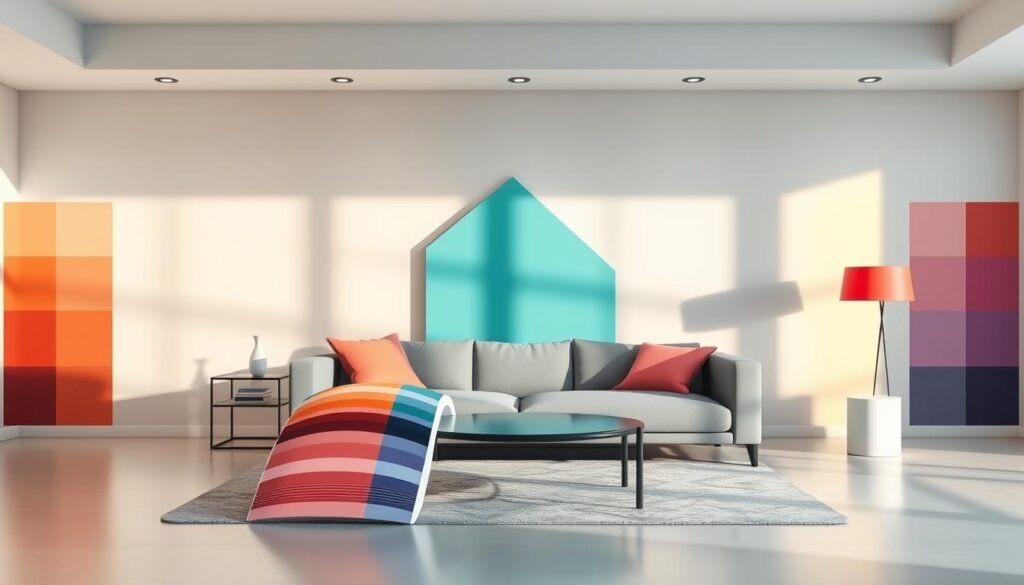
1. Warm Mahogany — Rich Red That Feels Grounded
Warm Mahogany is Glidden and PPG’s 2026 Color of the Year. It is a deep, grounded red with enough brown in it to feel sophisticated rather than bright or theatrical.
In a living room, this kind of color works well on a feature wall, built-in cabinetry, a fireplace surround or even all four walls in a room with good natural light. The easiest way to keep it elegant is to surround it with cream upholstery, medium-to-dark wood and a small amount of warm metal.
See Glidden’s official 2026 Warm Mahogany palette.
Style it with lighter, tactile accents
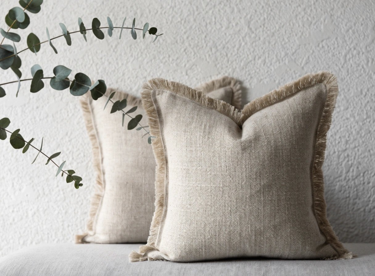
A mahogany wall becomes much more livable when the accessories are soft and pale. Browse cream and linen-look pillow covers on Amazon for an easy contrast.
2. Silhouette — Espresso Brown with Charcoal Depth
Benjamin Moore selected Silhouette AF-655 as its 2026 Color of the Year. The brand describes it as a rich espresso tone with subtle charcoal notes. This is one of the strongest signals that brown is no longer just a supporting neutral – it can now be the statement color.
Silhouette works especially well where you want architectural definition. Think bookcases, a media wall, paneling or a cozy reading corner. If you use it broadly, balance it with lighter ceilings, warm white textiles and reflective surfaces.
See Benjamin Moore’s official 2026 Color of the Year.
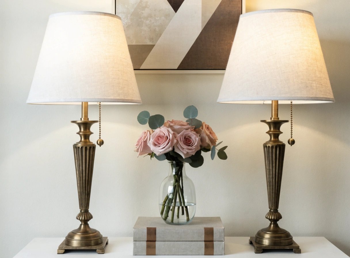
Amazon idea: antique-brass accents
Deep espresso walls look particularly good with warm metallic details. Browse antique-brass living room lamps on Amazon.
3. Universal Khaki — The New Warm Neutral
HGTV Home by Sherwin-Williams chose Universal Khaki HGSW6150 for 2026, anchoring its Honest Essentials collection. This sandy mid-tone neutral is a useful alternative for anyone who is tired of cold gray but does not want beige to feel yellow.
Khaki works especially well in living rooms with natural materials. Oak, jute, stone, woven baskets and ivory upholstery all become more dimensional against a khaki wall.
Explore the official 2026 Honest Essentials collection.
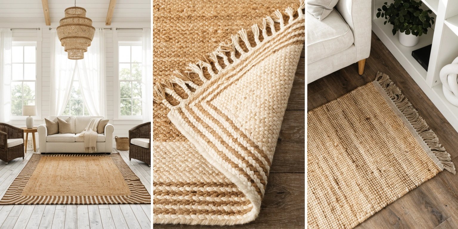
Amazon idea: natural jute texture
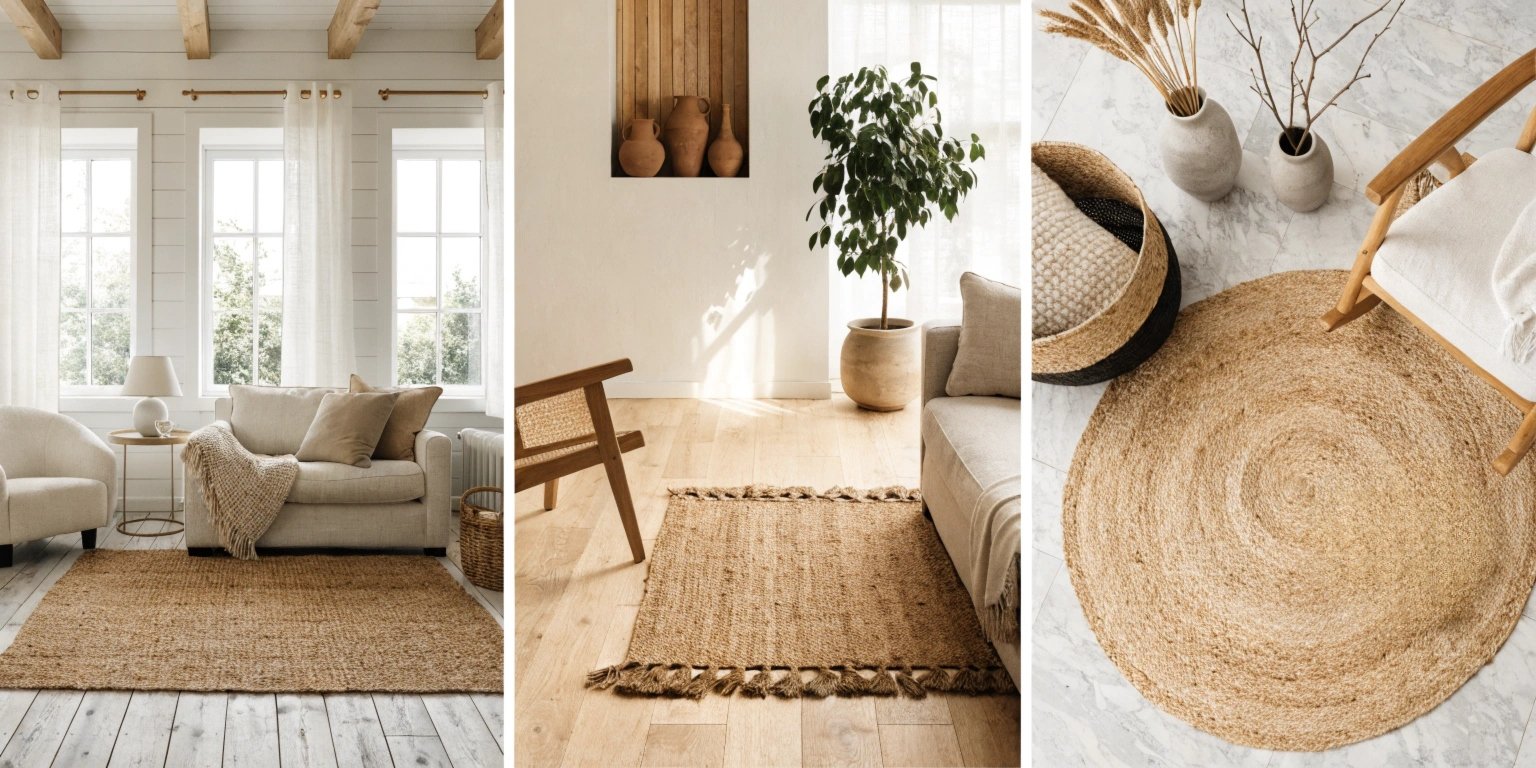
A woven rug reinforces the warm, grounded direction without adding another strong color. Shop natural jute area rugs on Amazon.
4. Hidden Gem — Smoky Jade for a Sophisticated Green Room
BEHR’s 2026 Color of the Year, Hidden Gem, is a smoky jade that sits between green and blue. It is richer than sage but still nature-inspired, which makes it ideal for someone who wants a living room with color that does not feel loud.
Use it with warm wood rather than icy gray furniture. Cream bouclé, camel leather, walnut and matte black accents all help smoky jade look contemporary.
See BEHR’s official 2026 Hidden Gem.
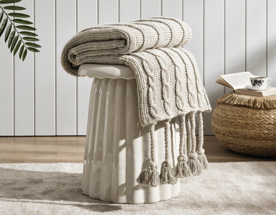
Amazon idea: warm neutral throws
Browse camel and warm-beige throws on Amazon to soften a dark green palette.
5. Melodious Ivory — Creamy Without Feeling Flat
Dutch Boy’s 2026 Color of the Year is Melodious Ivory 313-2DB, a soft creamy beige designed as a flexible backdrop for natural materials and nostalgic, handcrafted details.
This is a strong choice for smaller or darker living rooms because it gives you warmth without demanding attention. Rather than pairing ivory with more beige, introduce contrast through dark wood, olive green, faded denim blue or terracotta.
Read about Dutch Boy’s official 2026 Melodious Ivory.
6. Cloud Dancer — A Soft White Reset
Pantone named PANTONE 11-4201 Cloud Dancer its Color of the Year 2026. A soft white may sound understated, but that is exactly why it works: it gives furniture, art, wood grain and architectural texture room to become the focal point.
For living rooms, the trick with a soft white is layering. Use at least three textures—perhaps linen, boucle and wood—so the room feels intentional instead of unfinished.
Explore Pantone’s 2026 Color of the Year.
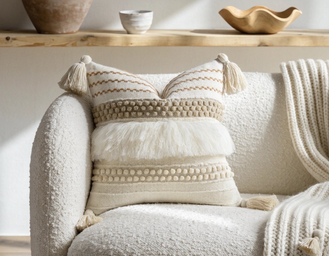
Amazon idea: texture instead of more color
Shop textured cream pillow covers on Amazon to build depth in a white room.
7. Cordovan — Wine Red for Smaller Doses
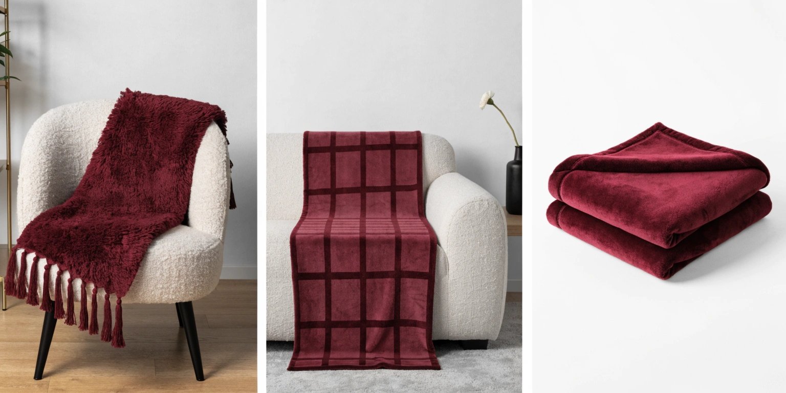
Within the HGTV Home by Sherwin-Williams 2026 collection, Cordovan HGSW6027 introduces a burgundy wine red. If Warm Mahogany feels too dark for your room, a wine shade can be easier to use selectively.
Try it on an interior door, the back of built-ins, a reading nook or through upholstery and textiles. Burgundy looks especially refined with olive, camel, cream and aged brass.
8. Secret Garden — Saturated Mossy Green
Secret Garden HGSW6181 is another useful color in the 2026 Honest Essentials palette. It is deeper and more saturated than the pale sage greens that have been everywhere for several years.
That extra depth makes it useful on cabinetry, trim or a feature wall. In a living room with many plants, it can also make foliage feel integrated into the architecture rather than added as decoration.
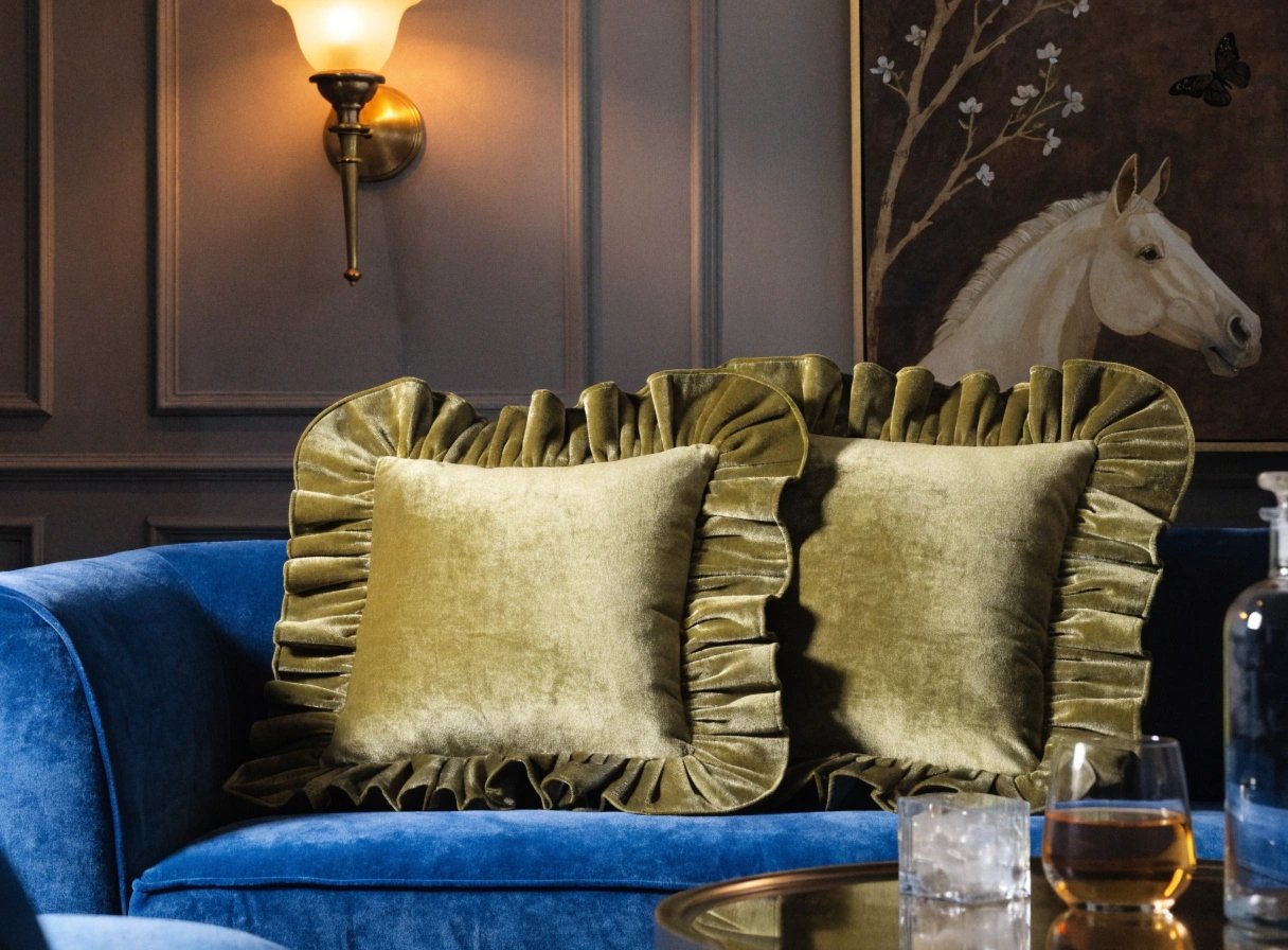
Browse olive and moss-green pillow covers on Amazon if you want to test the family before painting.
9. Hazel — Fresh Green-Blue for a Lighter Mood
Hazel HGSW6471 brings a cooler green into the same 2026 collection. It is useful when your living room needs more freshness than khaki or brown can provide but you still want the palette to connect with nature.
Pair Hazel with creamy white, pale oak and a small amount of rust or terracotta. The warm accent prevents a green-blue room from feeling too coastal unless that is the look you want.
10. Lemon Chiffon — Soft Yellow as an Accent Neutral
One of the more optimistic colors in the 2026 Honest Essentials collection is Lemon Chiffon HGSW6686, a soft buttery yellow. This family works especially well in sunlit rooms, alcoves and accessories rather than needing to cover every wall.
Yellow is particularly effective beside olive green, medium wood and warm white. Even a few cushions, ceramic pieces or artwork can introduce the effect.
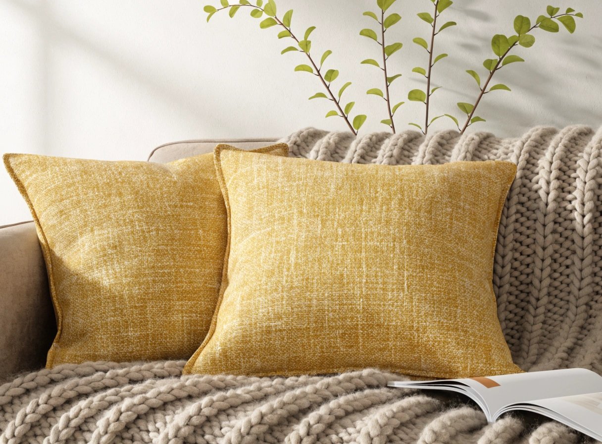
Browse butter-yellow pillow covers on Amazon.
How to Choose the Right 2026 Living Room Color for Your Light
Trend lists are useful for inspiration, but the same color can look completely different from one home to another. Before committing, test large samples and look at them in morning, afternoon and evening light.
- North-facing rooms: warm ivory, khaki, clay and yellow can counter cooler natural light.
- South-facing rooms: deeper greens, wine reds and espresso browns can handle abundant warm light.
- Low-light rooms: do not assume white is always the answer. A warm mid-tone can sometimes make a dim room feel more intentional.
- Open-plan spaces: choose shades with related undertones so transitions between rooms feel deliberate.
Do Not Skip Paint Samples
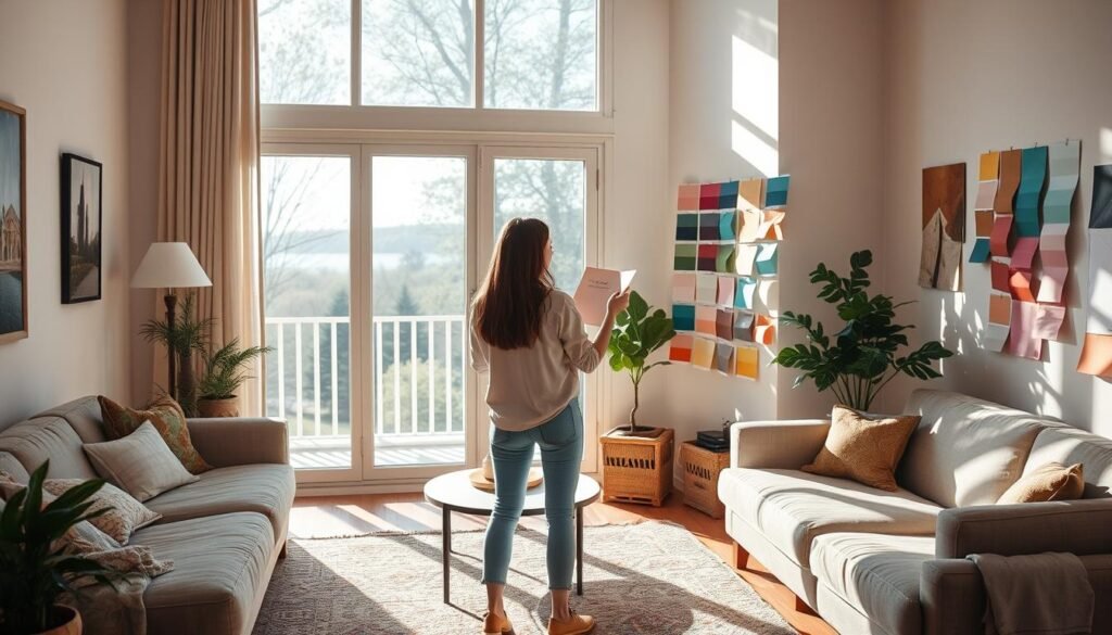
Small paint chips are helpful for narrowing choices, but they are not enough for a full wall decision. Test a large removable sample or paint a generous section of board so you can move it around the room.
Browse paint sample boards and testing supplies on Amazon.
How to Combine 2026 Colors Without Making the Room Busy
You do not need to use several trend colors just because you like them. A simple distribution usually looks more polished:
- 60% foundation: walls and large surfaces.
- 30% secondary color: sofa, rug, curtains or major wood tone.
- 10% accent: cushions, art, lamps and smaller decorative objects.
For example, Universal Khaki can be the foundation, Secret Garden the secondary color and Cordovan a small accent. Or Cloud Dancer can anchor the room while Silhouette appears in built-ins and Lemon Chiffon adds a small amount of brightness.
How to Test the 2026 Palette Without Repainting
Before committing to a full wall color, introduce the palette in one movable element and watch how it behaves in the room for several days. A throw, pillow cover, small rug, ceramic object or lampshade can show whether the undertone works with your flooring, upholstery and natural light.
- Green family: test olive or moss against your existing wood tones.
- Warm neutrals: compare ivory and khaki beside the sofa and flooring before choosing paint.
- Deep reds: introduce burgundy through one textile or artwork first.
- Soft yellow: test it near both daylight and evening lamps because it can shift dramatically.
- Espresso brown: try it in a smaller object or sample board before using it on built-ins or walls.
Final Thoughts: 2026 Is About Warmer, More Personal Color
The most interesting thing about the living room color trends of 2026 is not one single winning shade. It is the movement away from anonymous cool neutrals toward colors with warmth and personality.
Warm Mahogany, Silhouette and Hidden Gem make a strong case for deeper walls. Universal Khaki, Melodious Ivory and Cloud Dancer offer quieter foundations. Secret Garden, Hazel, Cordovan and Lemon Chiffon give you ways to layer in color without redesigning the entire room.
Choose the shade that works with your actual light, flooring and furniture—not simply the one with the strongest trend label. That is what will make the room still feel good long after 2026 is over.